Seven years on, Kristin Hjellegjerde Gallery’s brand identity, created by C&G Partners, has expanded alongside the gallery. Beginning with one outpost in Wandsworth, South London, the gallery has since expanded to include locations in London Bridge and Berlin, as well as two summer spaces: a former factory in Norway, and an 18th-century manor house in Schloss Görne, Germany.
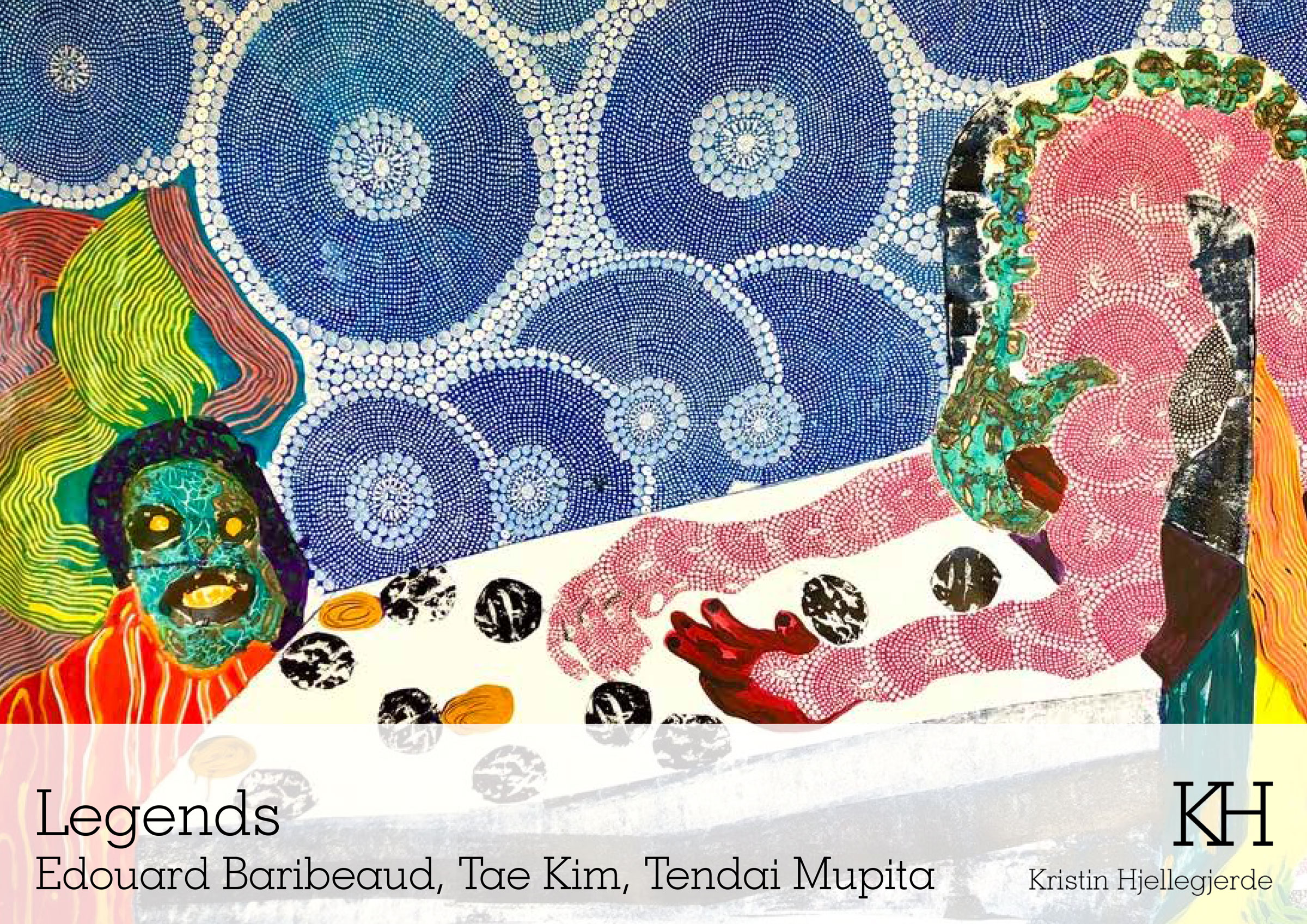
The visual identity system was designed to be at home when adjacent to a range of artistic mediums. Representing both emerging and established artists, the gallery focuses on artworks with strong theoretical and aesthetic bases.
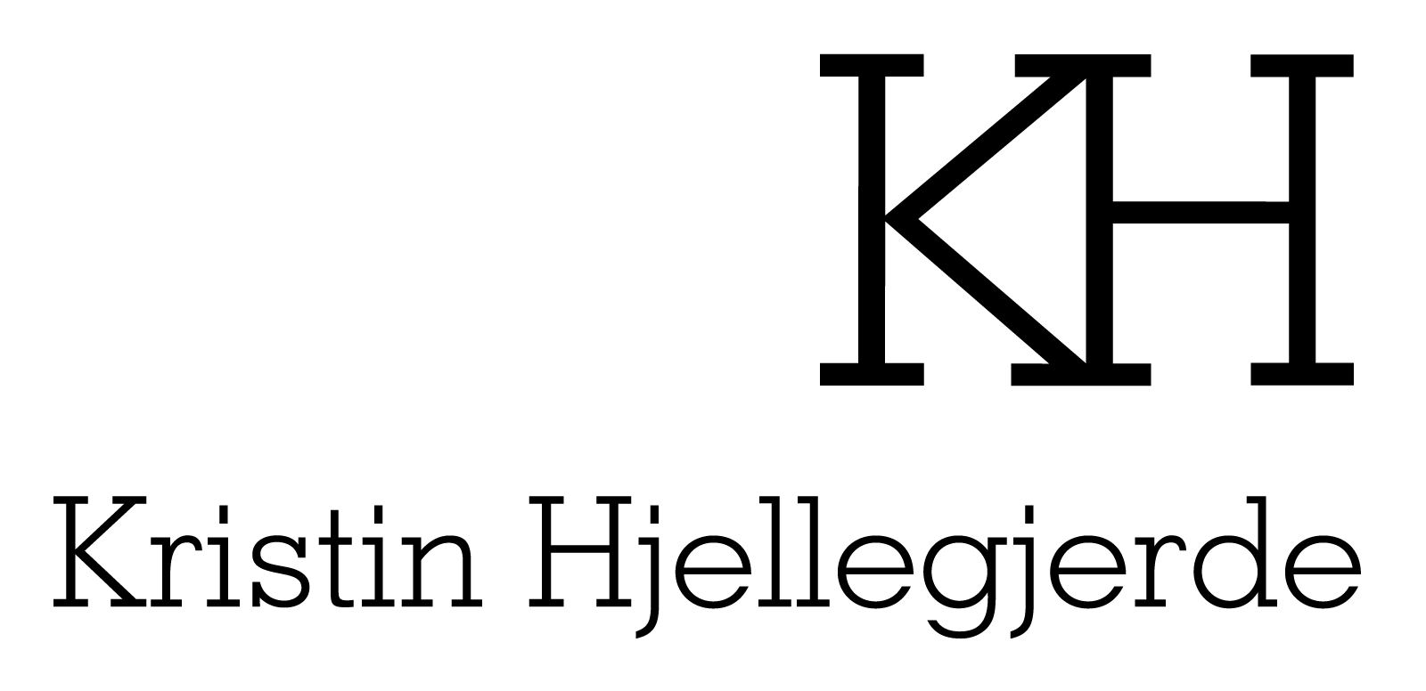
When designing the new identity, C&G acknowledged that the full name is not the easiest for all audiences to say at first (“Hjellegjerde” is pronounced “helleh-yair-deh”). The brand instead combines the two initials into a custom “KH” monogram. The black-and-white symbol uses a simple vocabulary of uniform lines to create conjoined slab-serif letters.
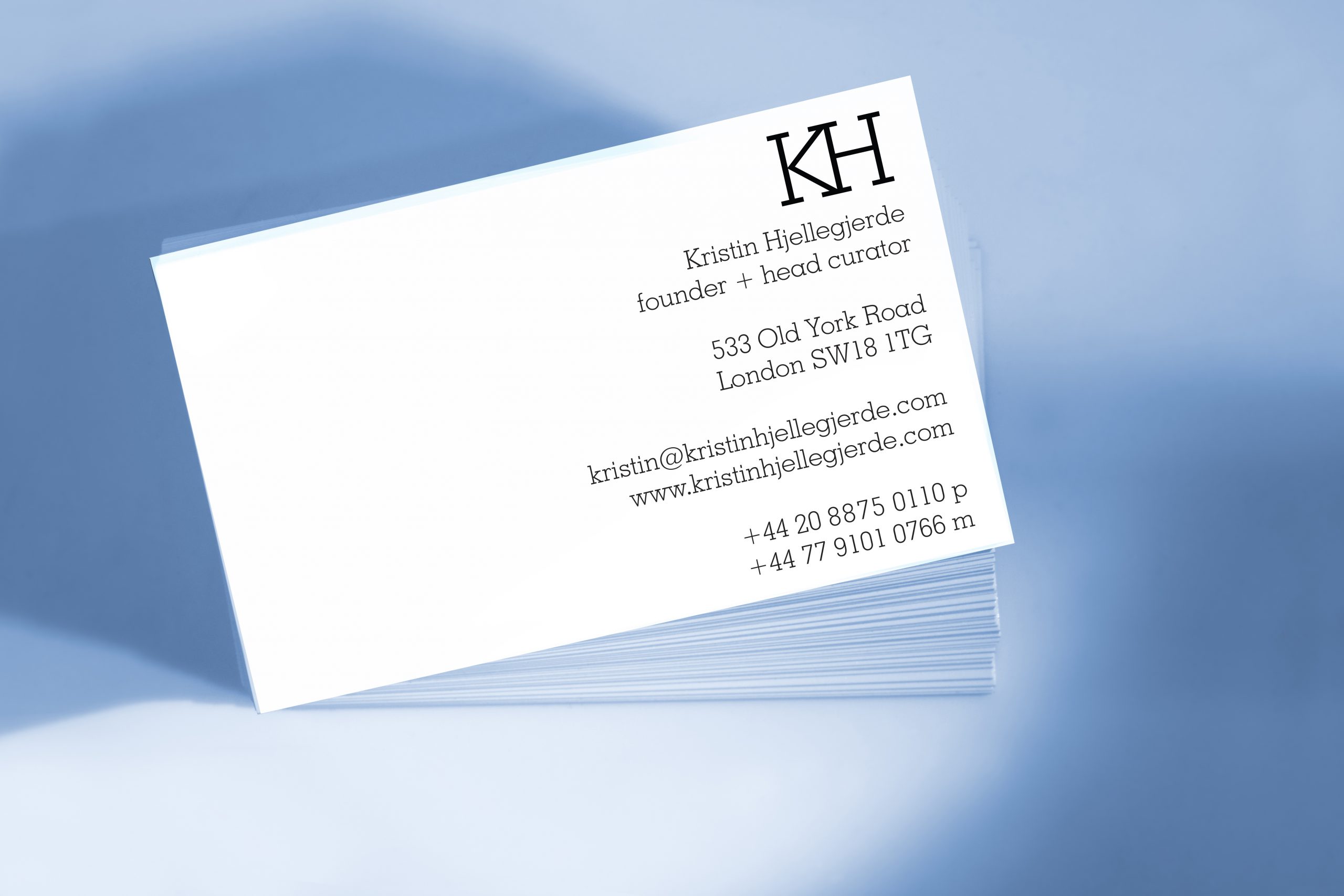
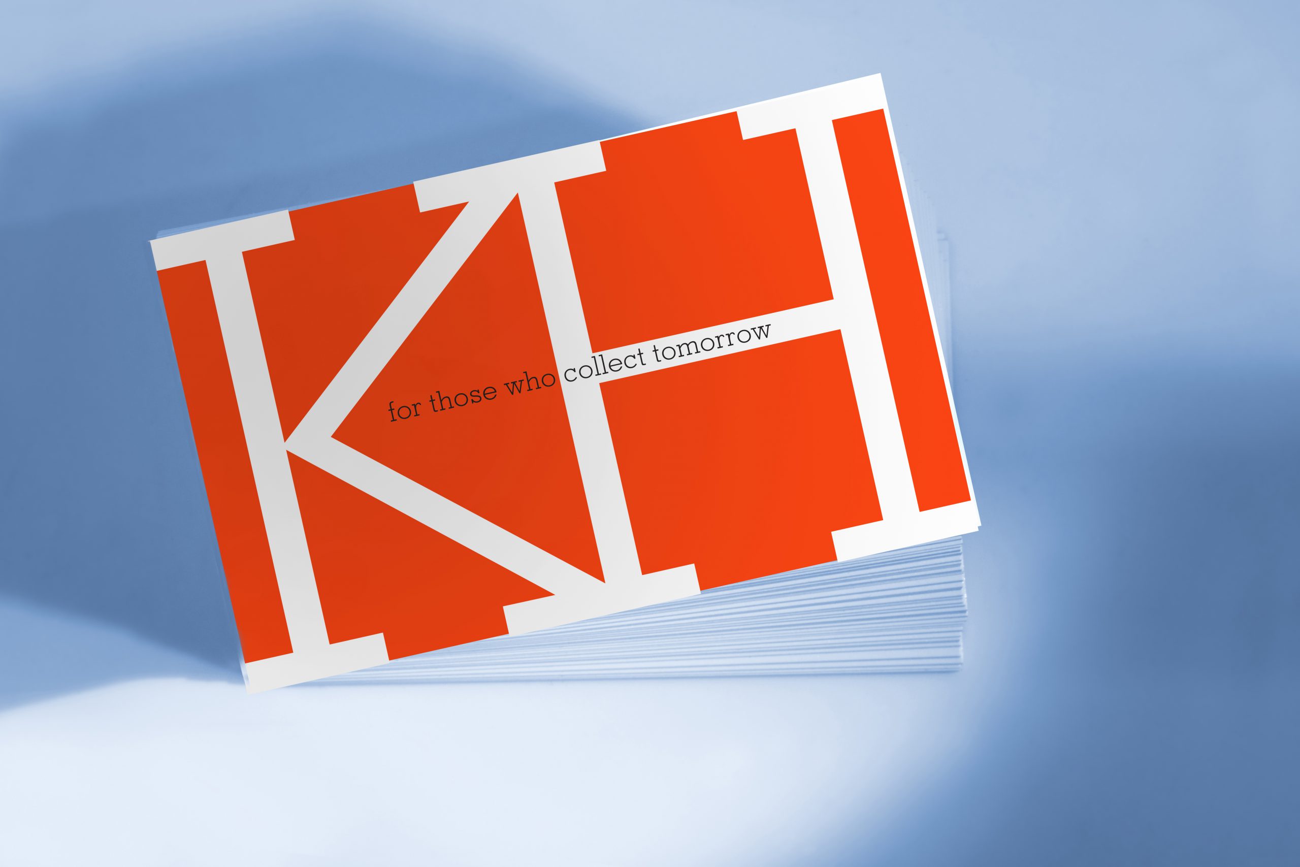
Along with the new name and identity, the firm developed guidelines for the look of the website, social media, and print graphics. The minimalistic but distinctive monogram is designed to be both legible and stylistically appropriate in the contemporary art publications where it appears.
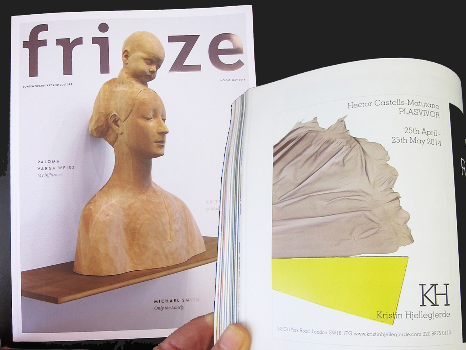
It avoids any strong style or color, in favor of neutrality that can embrace any art the gallery may depict in future advertisements.
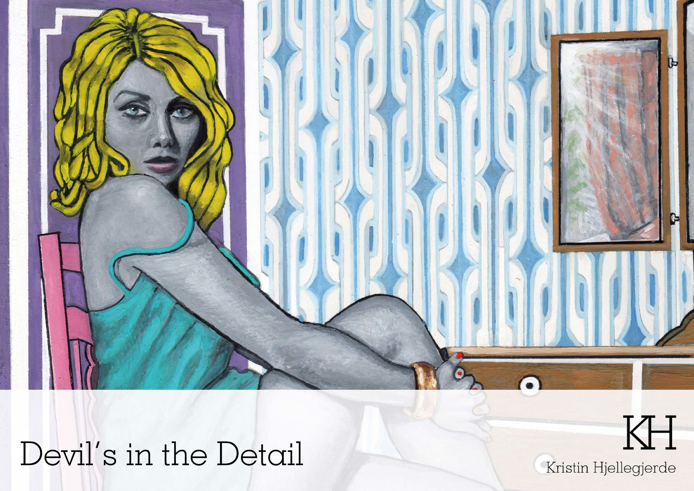
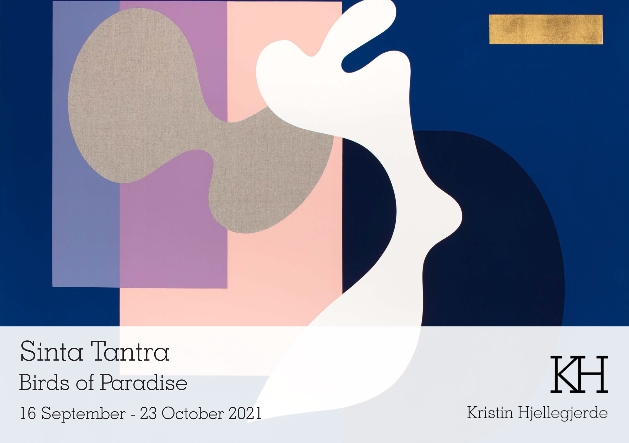
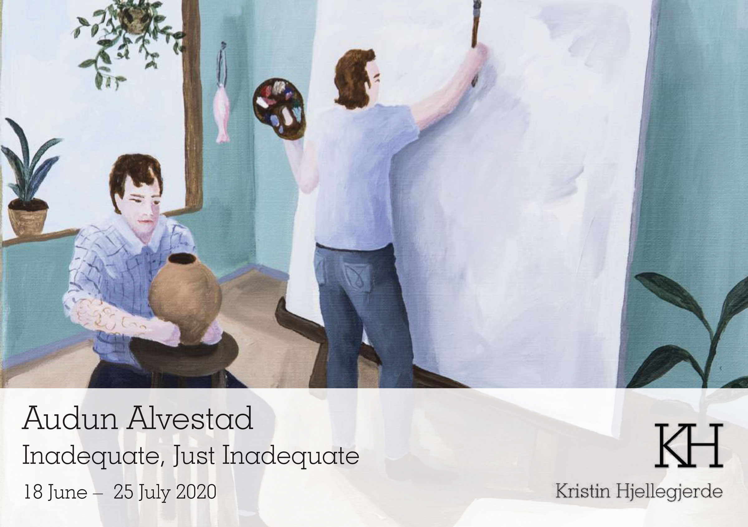
The next opening at the London gallery space will be of Belgian artist Joachim Lambrechts, starting on the 12th of November.
![C&G Partners [logo]](https://www.cgpartnersllc.com/wp-content/uploads/2022/07/CGP_Logo-black.png)