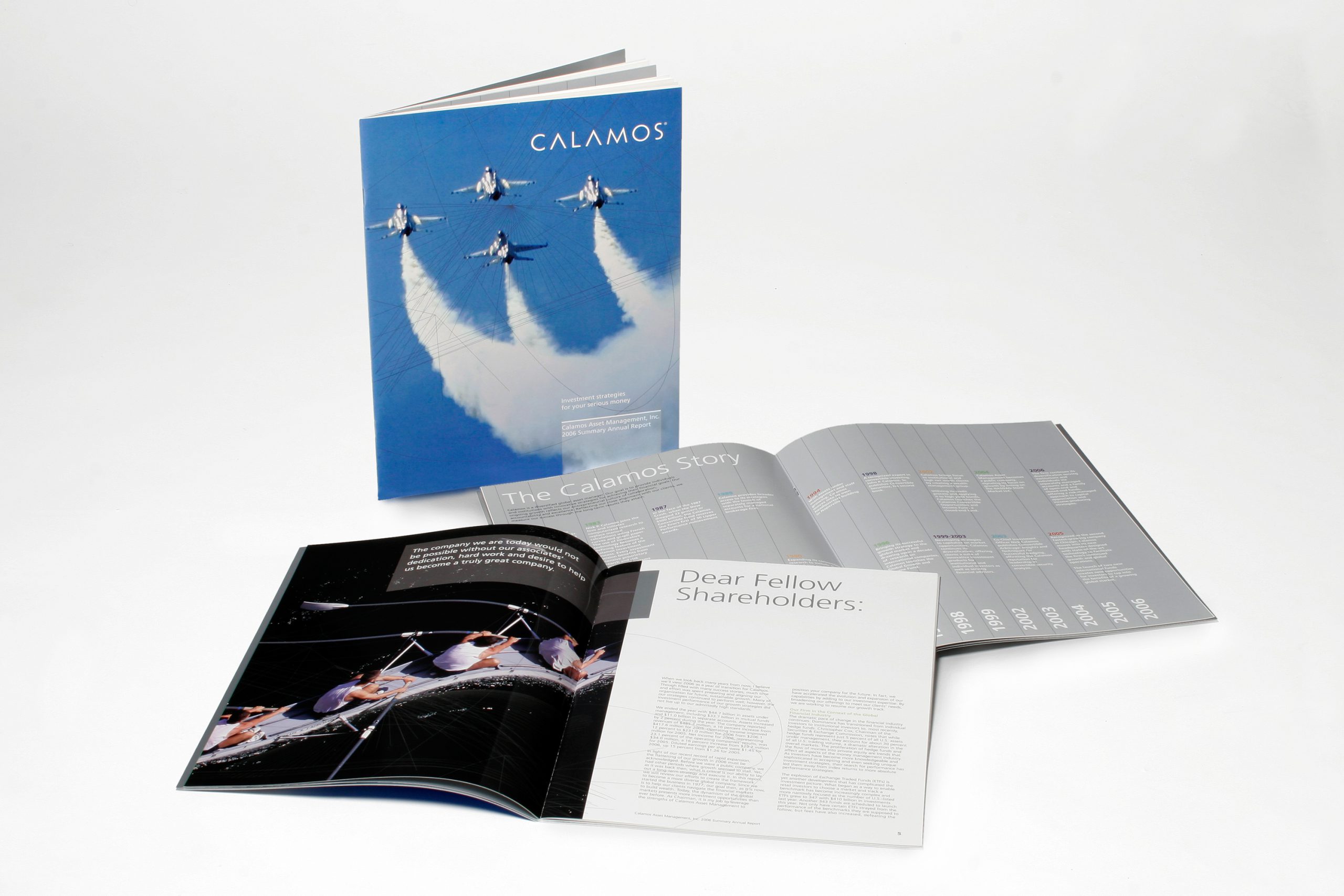


When John Calamos transformed $5,000 of his parents’ grocery store savings into a retirement nest egg, Calamos Investments was born. C&G Partners' rebranding initiative coincided with the company’s 30th anniversary and was begun to better reflect the remarkable success of the business. This new unified visual identity allows Calamos to be linked by a single master brand that can acquire meaning independent of the company’s founder, an objective that reflected the company’s plans for growth. Since the Calamos name is unique, a wordmark was chosen that employs modern letterforms in their utmost simplicity so that they read as abstract symbols yet remain legible as type. The silver color reflects both the technical aspect of the business and its monetary rewards. To express the role of information technology in shaping investment decisions, photographs are overlaid with linear patterns drawn from data visualization.
![C&G Partners [logo]](https://www.cgpartnersllc.com/wp-content/uploads/2025/09/CGP20_black_orange_RGB.png)
