Yesterday, C&G Partners launched a new website, a new visual brand, and new print collateral for the Samuel H. Kress Foundation, a leading US organization in the advancement of the history, conservation, and enjoyment of European art, architecture, and archaeology from antiquity to the 19th Century. Here are some images from the branding, print and web projects, which use beautiful images and stories of the Kress collection itself to make the user experience memorable.
The new logotype. The elegant shape of the “K” was inspired by a decorative architectural detail from an S.H. Kress & Co. Art Deco building.

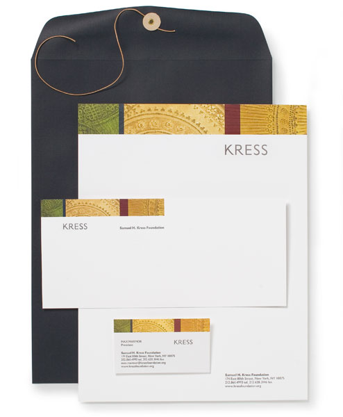
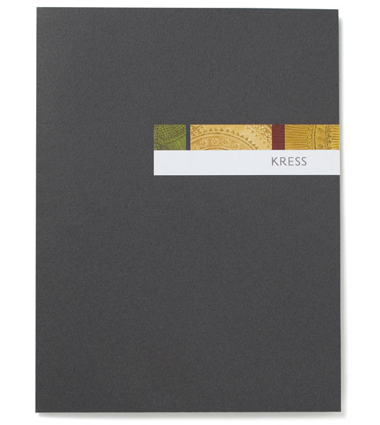
The stationery system features a collage of three different “punch marks,” which are decorative patterns that are embedded into a painting’s gilded surfaces:
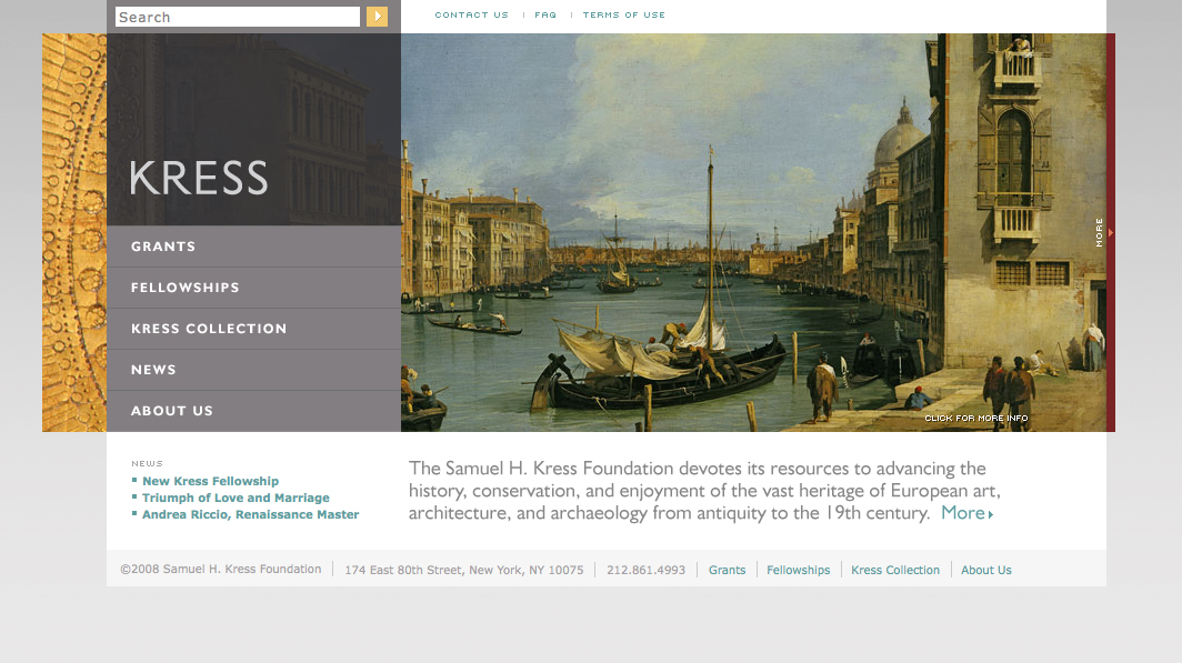
The new home page at www.kressfoundation.org features a panoramic vignette that changes with every visit. Or users can manually browse by clicking the “more” bar on the right:
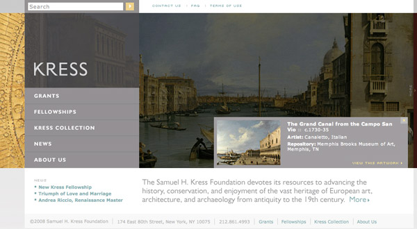
On every page of the site, users can click to see the full painting displayed and learn more about it:
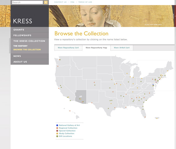
The collection can be browsed geographically …
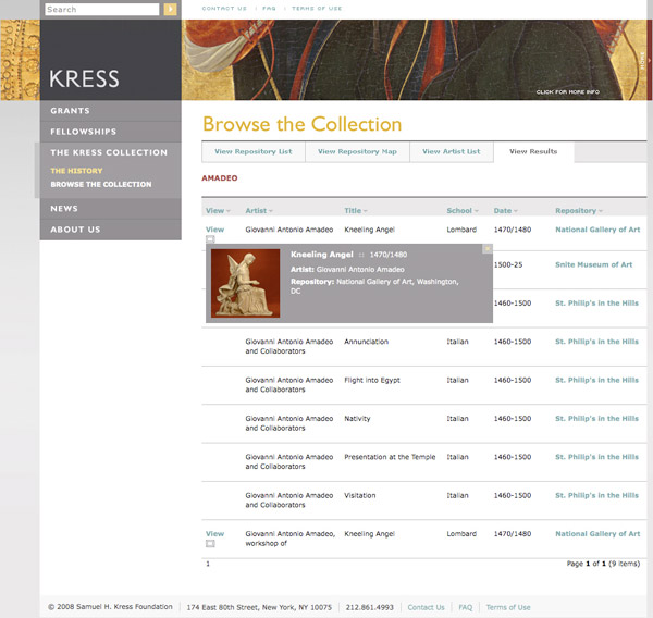
… and users can get a full list of an artist’s work in the collection, including informative DHTML pop ups:
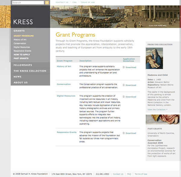
The grant programs page provides information on all available programs and immediate access to downloadable applications:
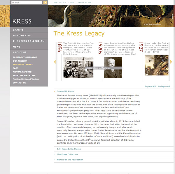
Dynamic interactive timeline of the history of Kress:
Experience the new site at www.kressfoundation.org. The website design effort was led by Associate Partner Maya Kopytman. The visual brand design effort was led by Partner Emanuela Frigerio.
![C&G Partners [logo]](https://www.cgpartnersllc.com/wp-content/uploads/2022/07/CGP_Logo-black.png)