This month, Hearst is celebrating 10 years of their iconic New York City headquarters—Hearst Tower—with the exhibition Building with History: The Exhibit, featuring work by tower architects Foster + Partners. Here at C&G, we are looking back at our milestone projects for this longtime client, include the Hearst Tower sign program; the interactive exhibition for Hearst’s flagship publication Good Housekeeping; and a construction barricade that could be called the biggest magazine rack in the world.
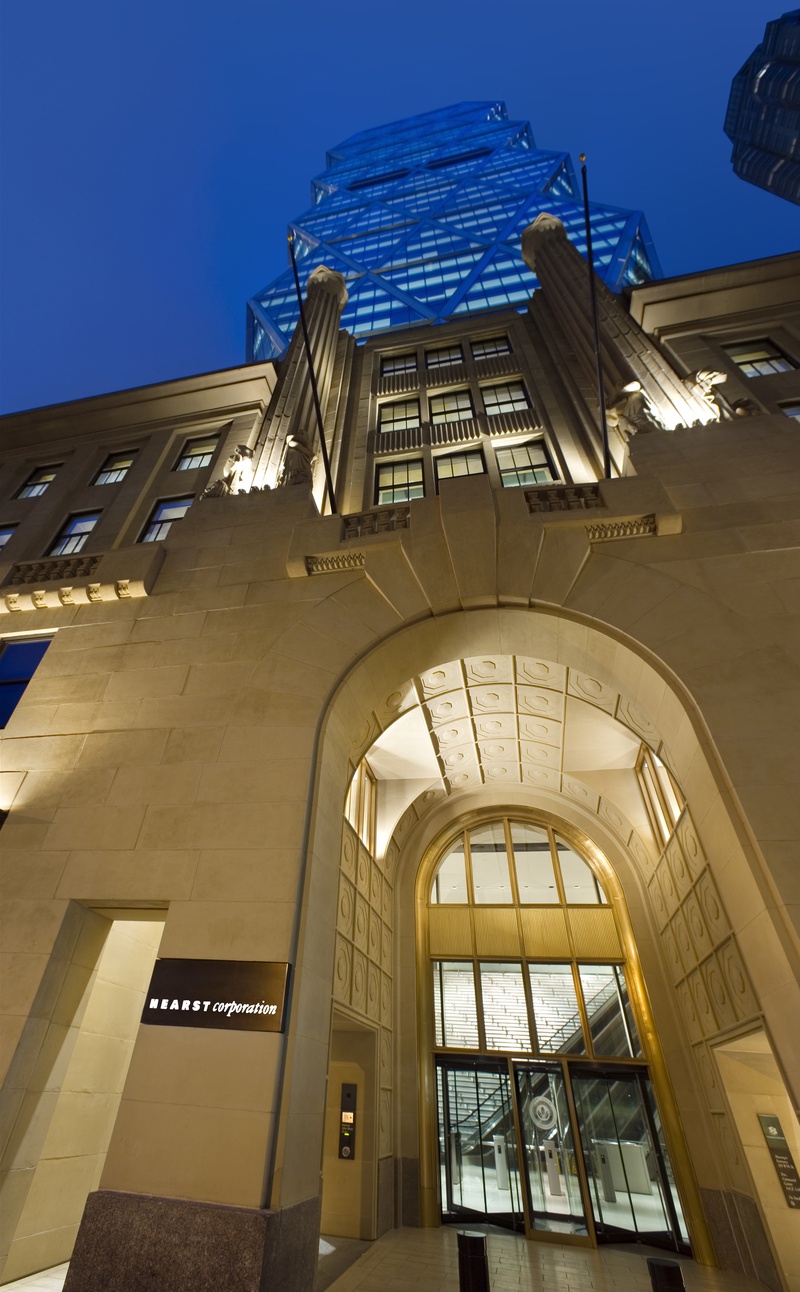
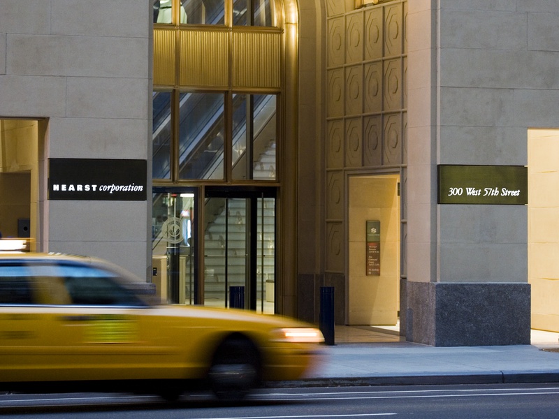
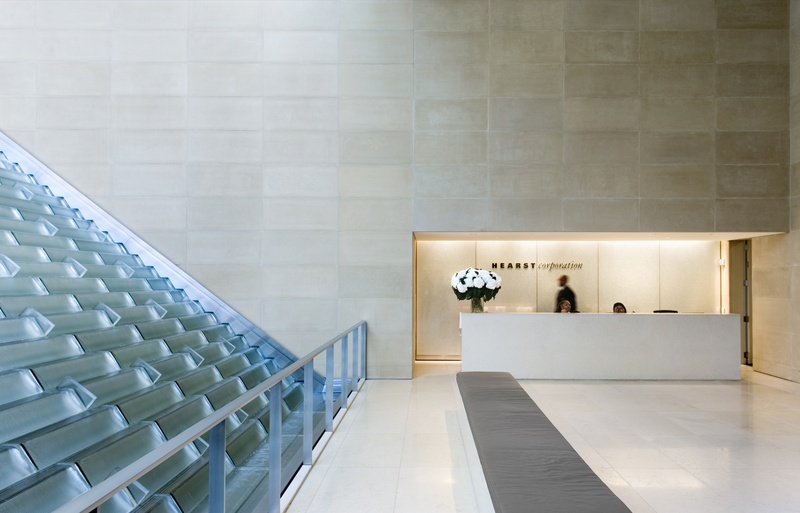
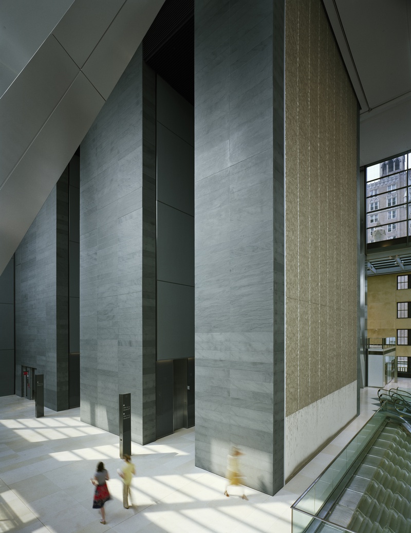
Foster + Partners’ 44-story addition to the original 1928, Art Deco building transformed Hearst Tower into a Manhattan landmark. C&G designed an integrated sign program for both the original building and the modern tower above it. The system typefaces related to the organization’s corporate identity. The centerpiece is a system of freestanding “totems” of glass and steel that serve multiple functions, housing directional information as well as security cameras and elevator keypads.
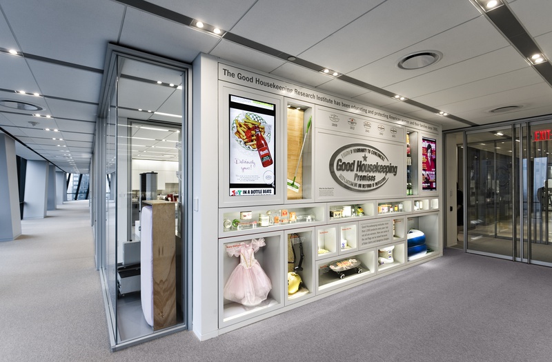
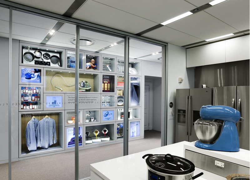
Our interactive exhibition and tour for Good Housekeeping reflect Hearst’s century of commitment to consumers and women’s advocacy. The exhibits describe the history of the magazine and its famous award program with displays that interweave behind-the-scenes views of the real test kitchen, textile, and appliance laboratories.
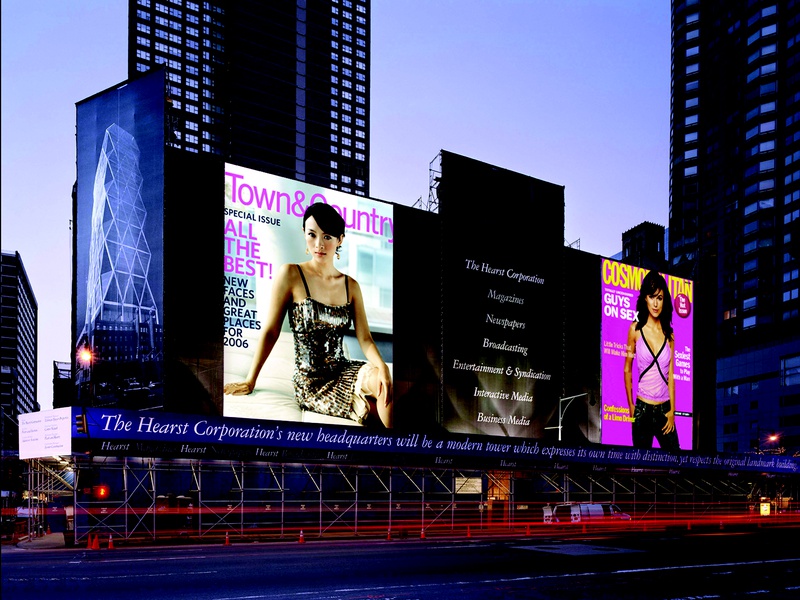
The construction barricade for Hearst Tower incorporated billboard-sized representations of the organization’s then-current magazine covers, changing as new issues hit the stands. Similar to all our projects for Hearst, one of the nation’s largest diversified media, information, and services companies, the barricade was created in collaboration with Hearst Corporation and Tishman Speyer.
![C&G Partners [logo]](https://www.cgpartnersllc.com/wp-content/uploads/2025/09/CGP20_black_orange_RGB.png)
