As we head to the Union Square Partnership Annual Meeting today, C&G Partners reveals its design for the community organization’s Annual Report 2016 and looks at the impact of the new brand identity originally that debuted a year ago. Now in our second year of collaboration with the Partnership, our design work aims to capture the culture of the vibrant nine-acre Manhattan district the Partnership is dedicated to enhancing.
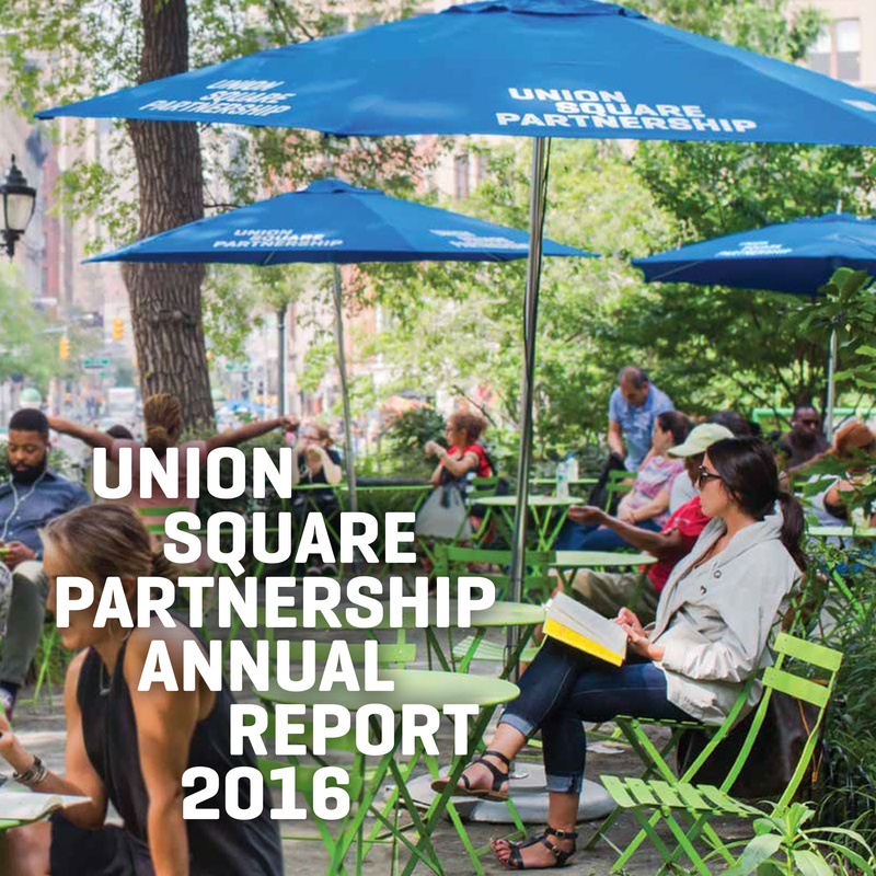
The Annual Report 2016 reflects the Partnership’s exceptional growth over the last year as well as the vitality of Union Square where people live, eat, learn, work, shop, and play. The report includes handy symbols that illustrate public investments funded by Union Square Partnership ranging from solar trash compactors to planters and landscaping; its detailed, numerical tables provide an economic snapshot and are offset by a visual calendar showcasing the neighborhood’s successes beginning with the new brand identity system.
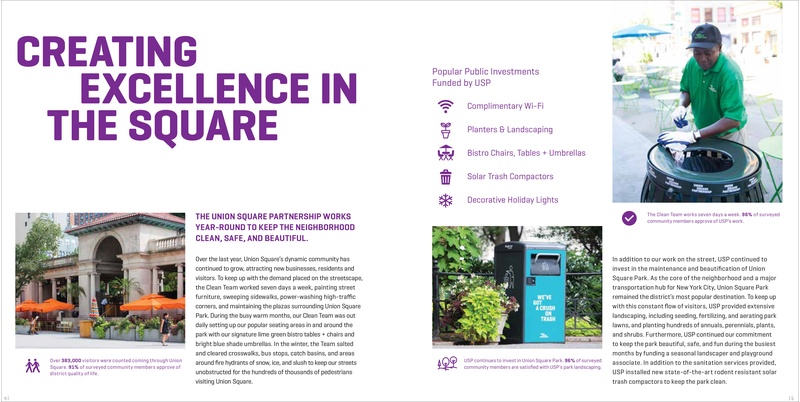
Creating a sense of place and highlighting Union Square’s urban community, this piece continues the spirit of the Union Square Partnership rebrand. The system uses a simple formula of colorful stacked typography that the Partnership and its vendors can easily adopt and adapt themselves, which is a good solution for a small staff of non-designers for a public institution.
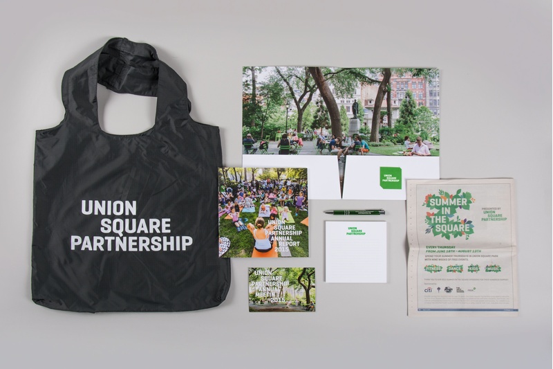
The system includes a flexible color palette in a range of distinct and approachable tones that can be used as a customizable tool, allowing the Partnership to easily create sub-brands and event materials with a consistent look and feel throughout the year. The result is a strong new brand identity, both for the organization and for the district itself.
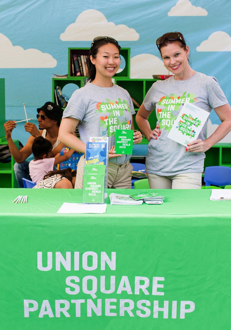
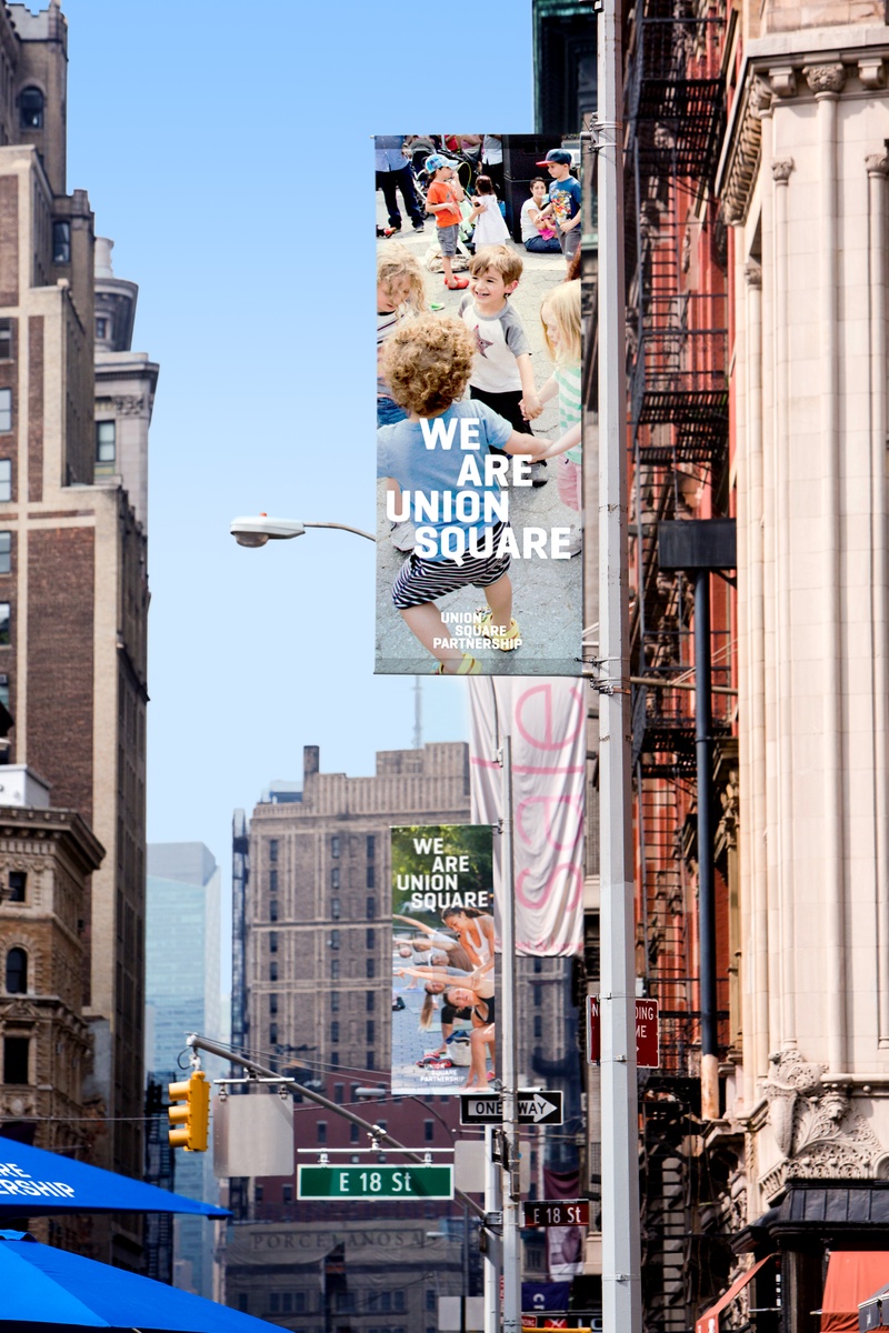
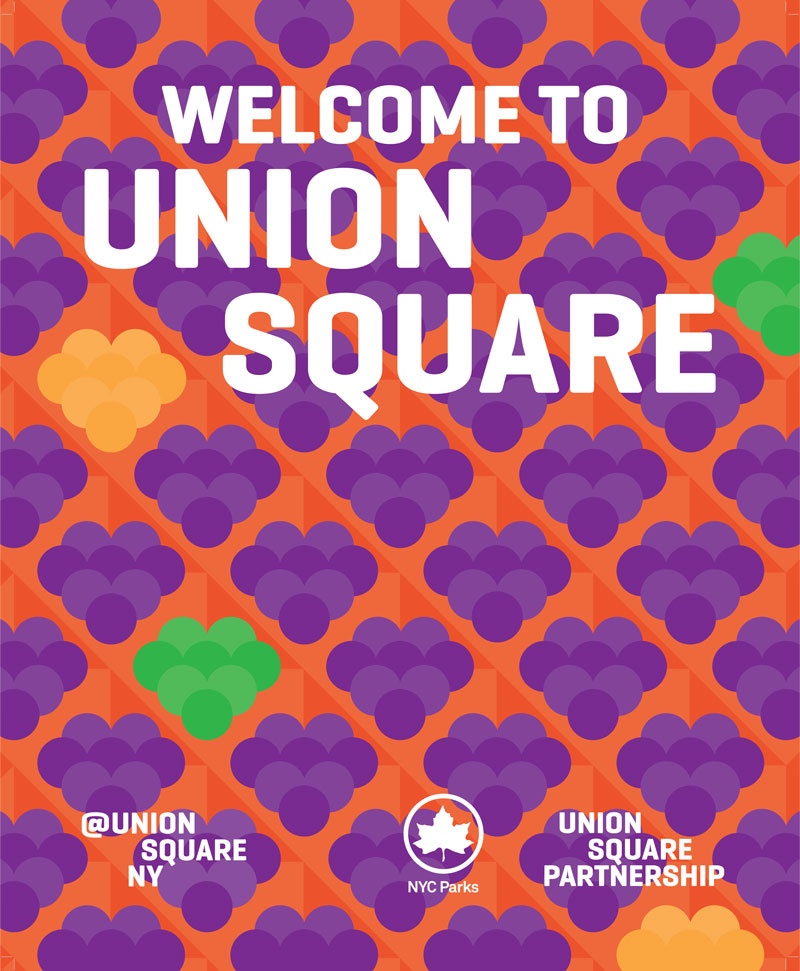
In addition to the brand identity system and annual report, C&G designed streetscape elements including banners, park posters, print collateral, and graphics for events such as Sweat Fest, Summer in the Square, and Harvest in the Square.
![C&G Partners [logo]](https://www.cgpartnersllc.com/wp-content/uploads/2025/09/CGP20_black_orange_RGB.png)
