C&G Partners’ latest design work for longtime client Union Square Partnership rolled out last week for the organization’s 22nd annual Harvest in the Square, its annual fundraising event where 50+ neighborhood restaurants provide food, with all proceeds going to park beautification and maintenance.
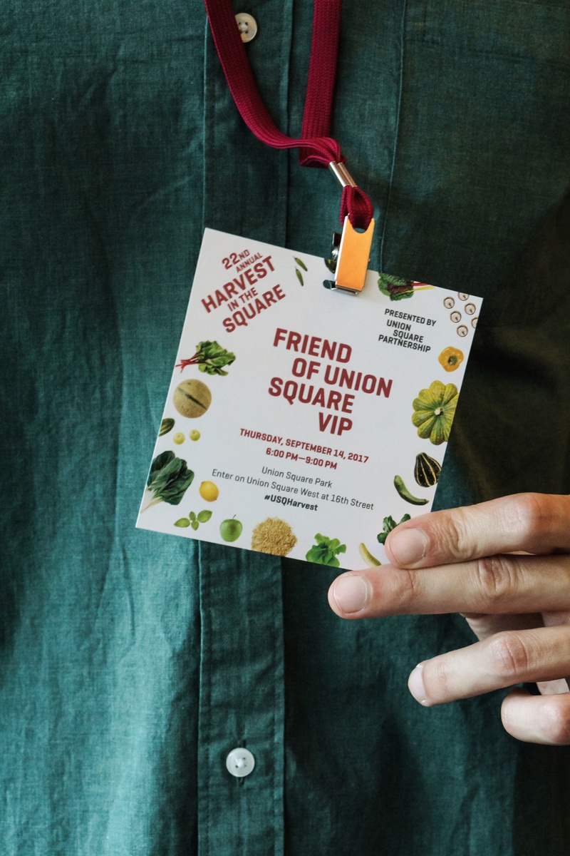
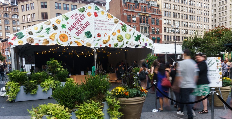
Graphics for this year’s Harvest in the Square event are unified with “flat lay” photography of an infinite field of seasonal ingredients, everything from zucchini and butternut squash to saffron and pumpkin seed. The result is a sort of explosion of everything that goes into great food.
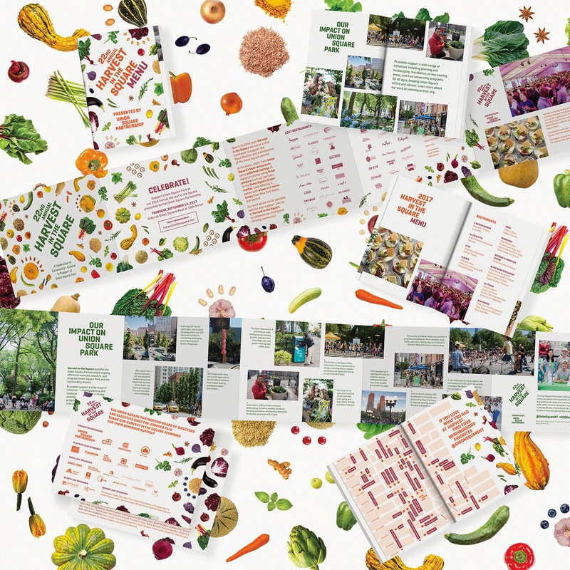
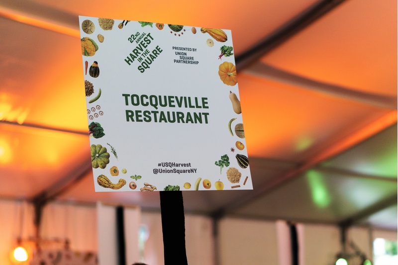
The resulting patterns are general enough to refer to all the cuisines of the participating restaurants, but unique enough to give the 22nd annual event a look of its own. Typography, as always, comes in a staggered, organic arrangement springing from the original USP brand system designed by C&G Partners.
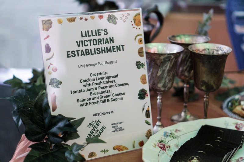
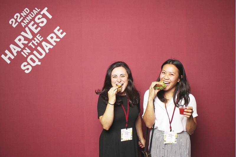
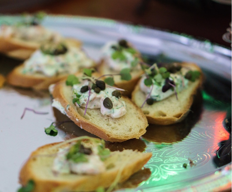 This September’s Harvest in the Square included more than 1,200 attendees tasting dishes from the culinary community that spans restaurants, bakeries, wineries, breweries and more. The event raised $367,000 to support park maintenance, beautification and programs.
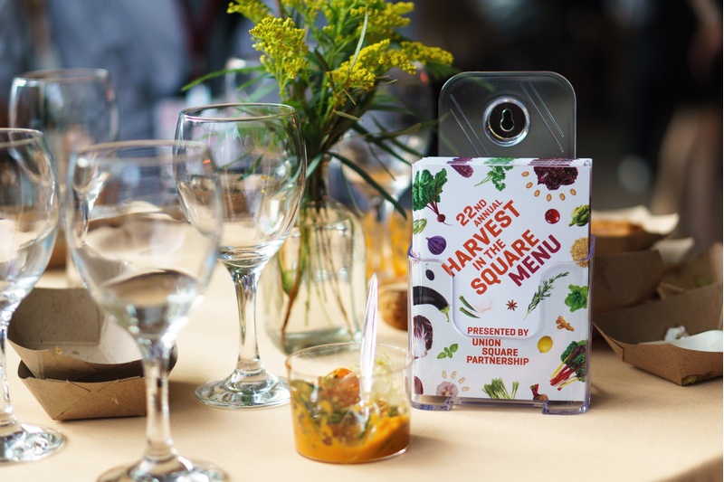
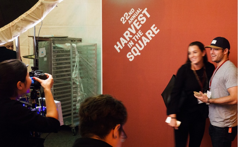
C&G Partners first worked with Union Square Partnership in 2015 to rebrand the organization. We went one step further, creating a visual system with the potential to “brand the neighborhood” itself. The brand identity system and rollout collateral that we designed represented the improvements Union Square Partnership is responsible for in the area, as well as create a sense of place that reflects the district’s unique vibrant urban character and diverse mix of people and businesses located there.
![C&G Partners [logo]](https://www.cgpartnersllc.com/wp-content/uploads/2022/07/CGP_Logo-black.png)