Interior, exterior, banner and donor graphics, designed around cropped "glimpses" of the art collection and sculpture gardens.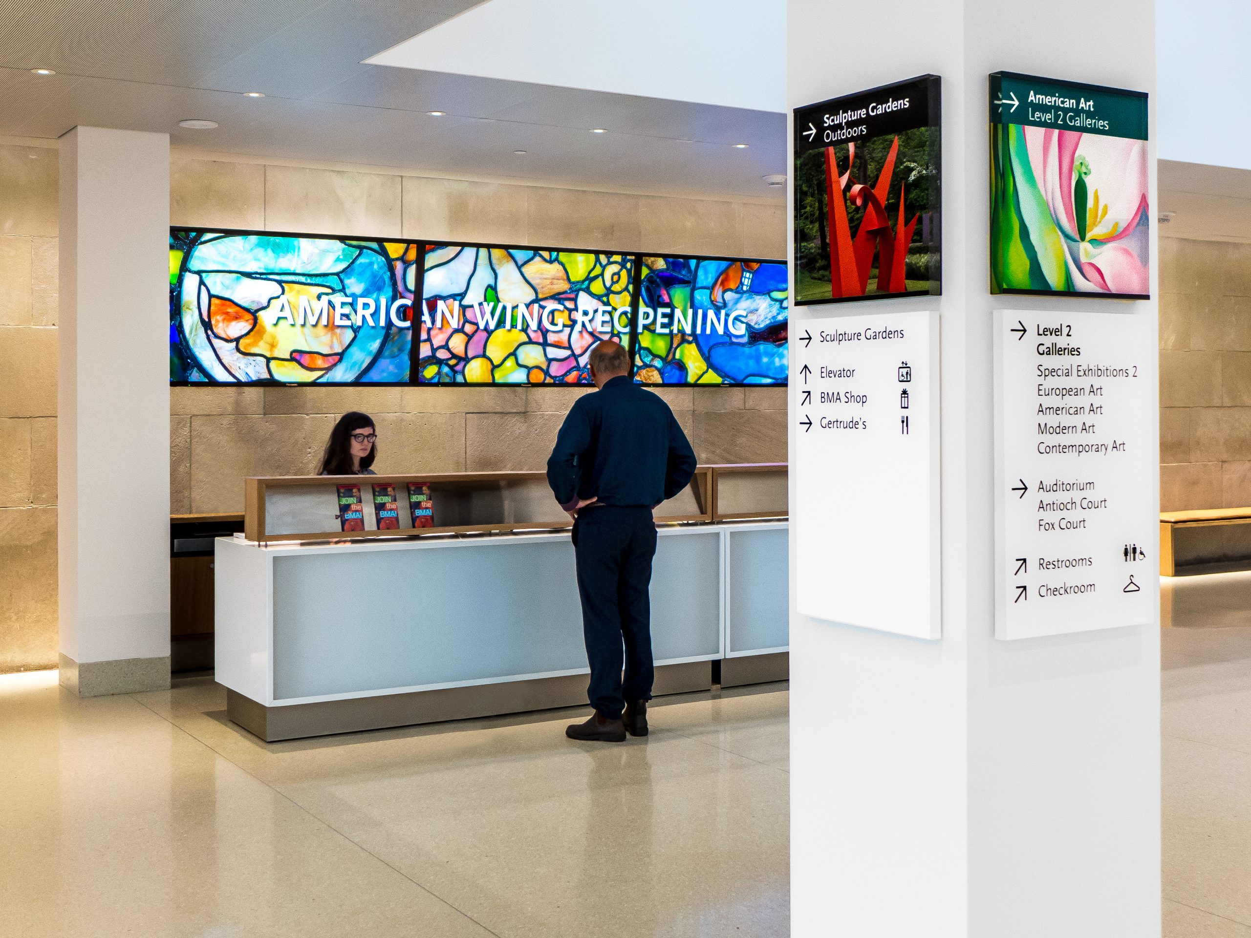
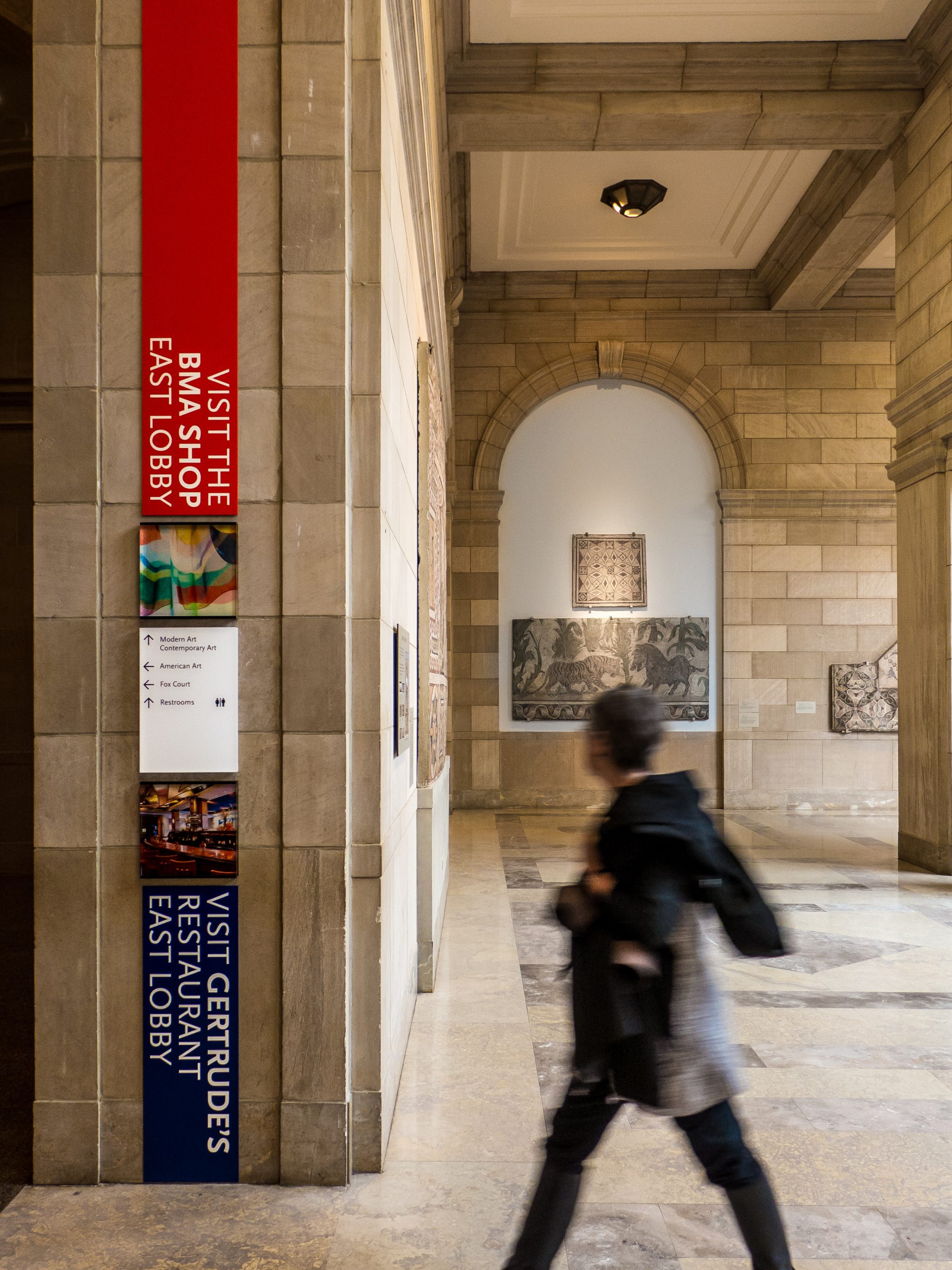
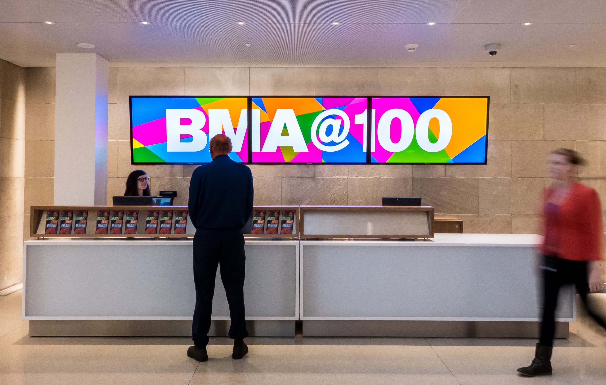
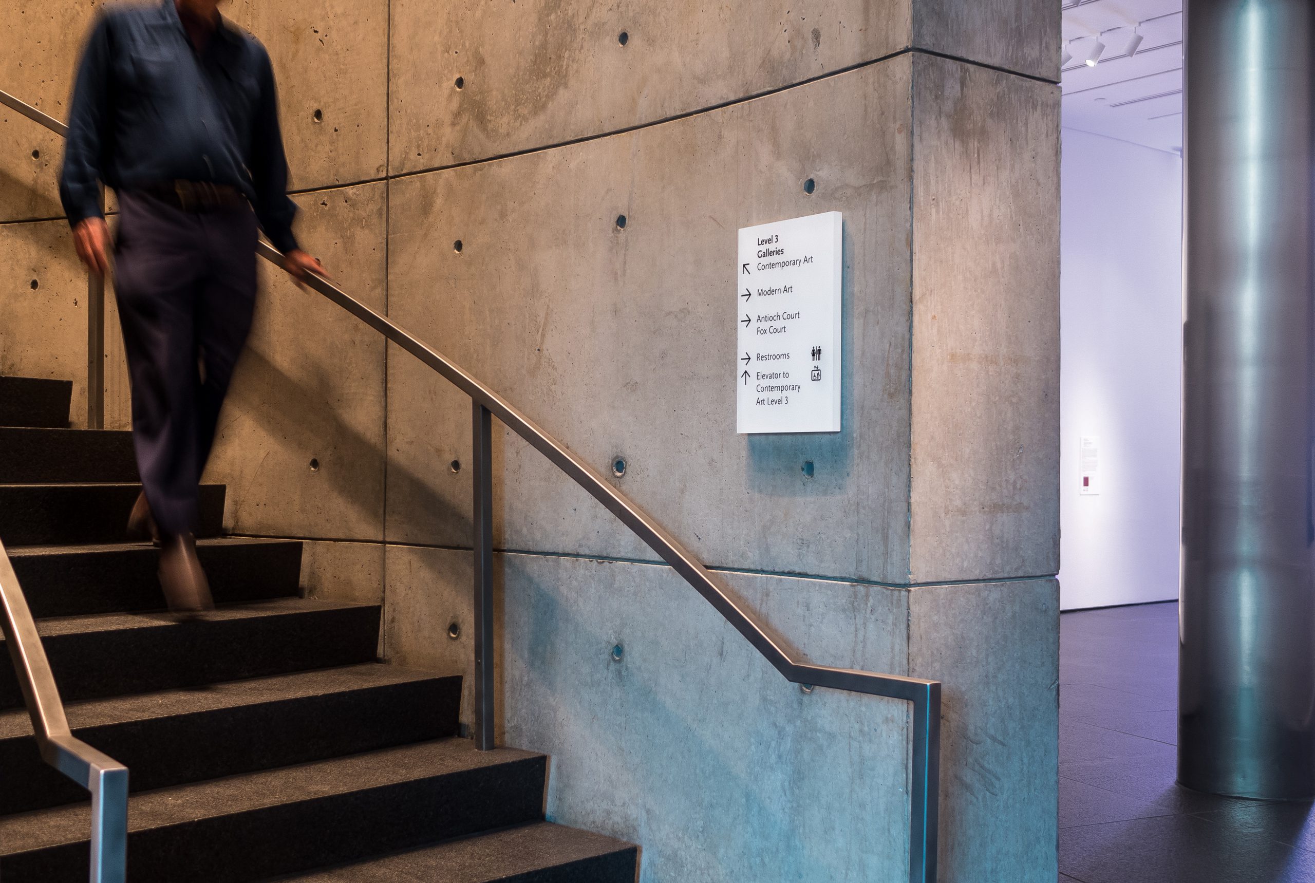
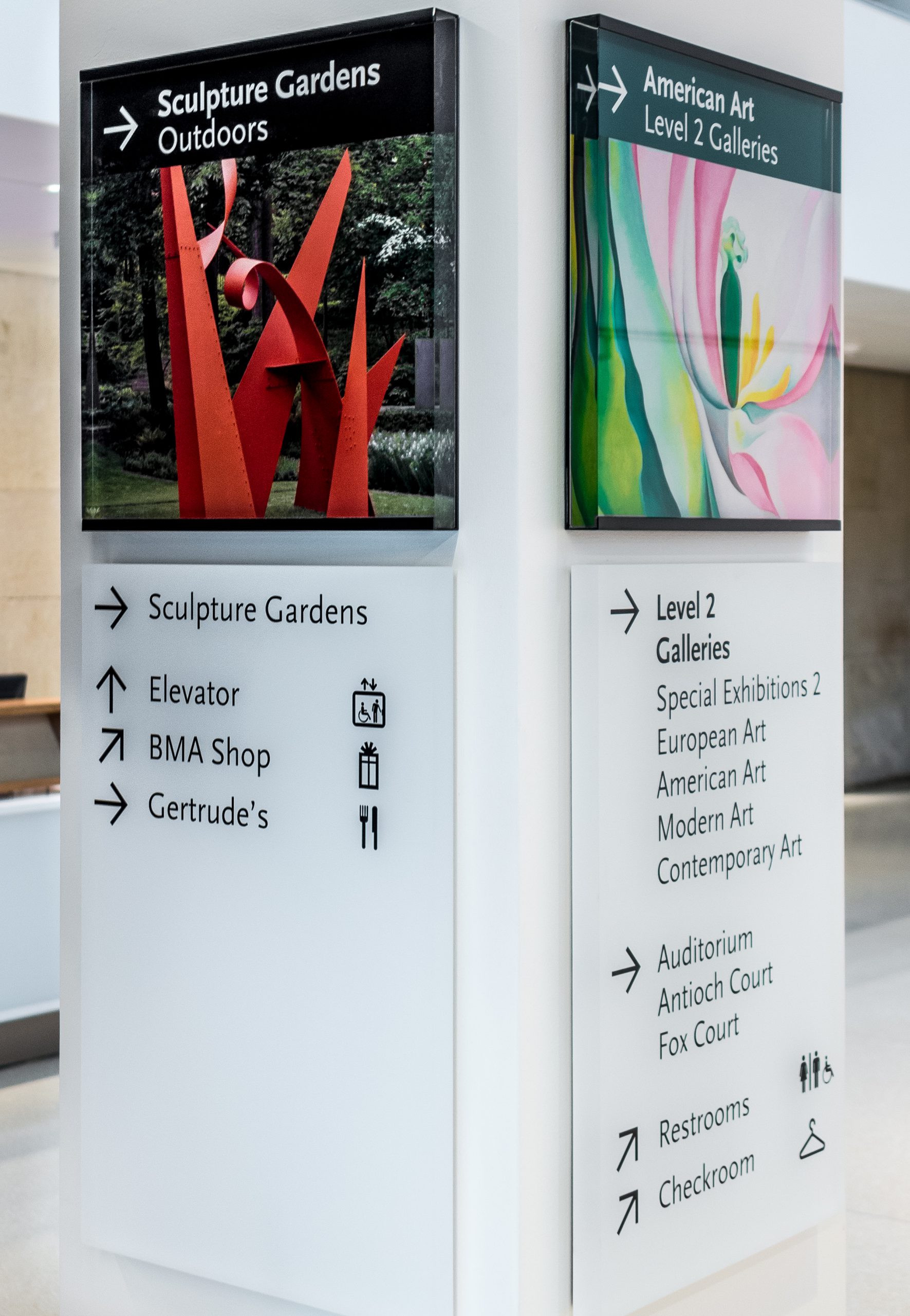
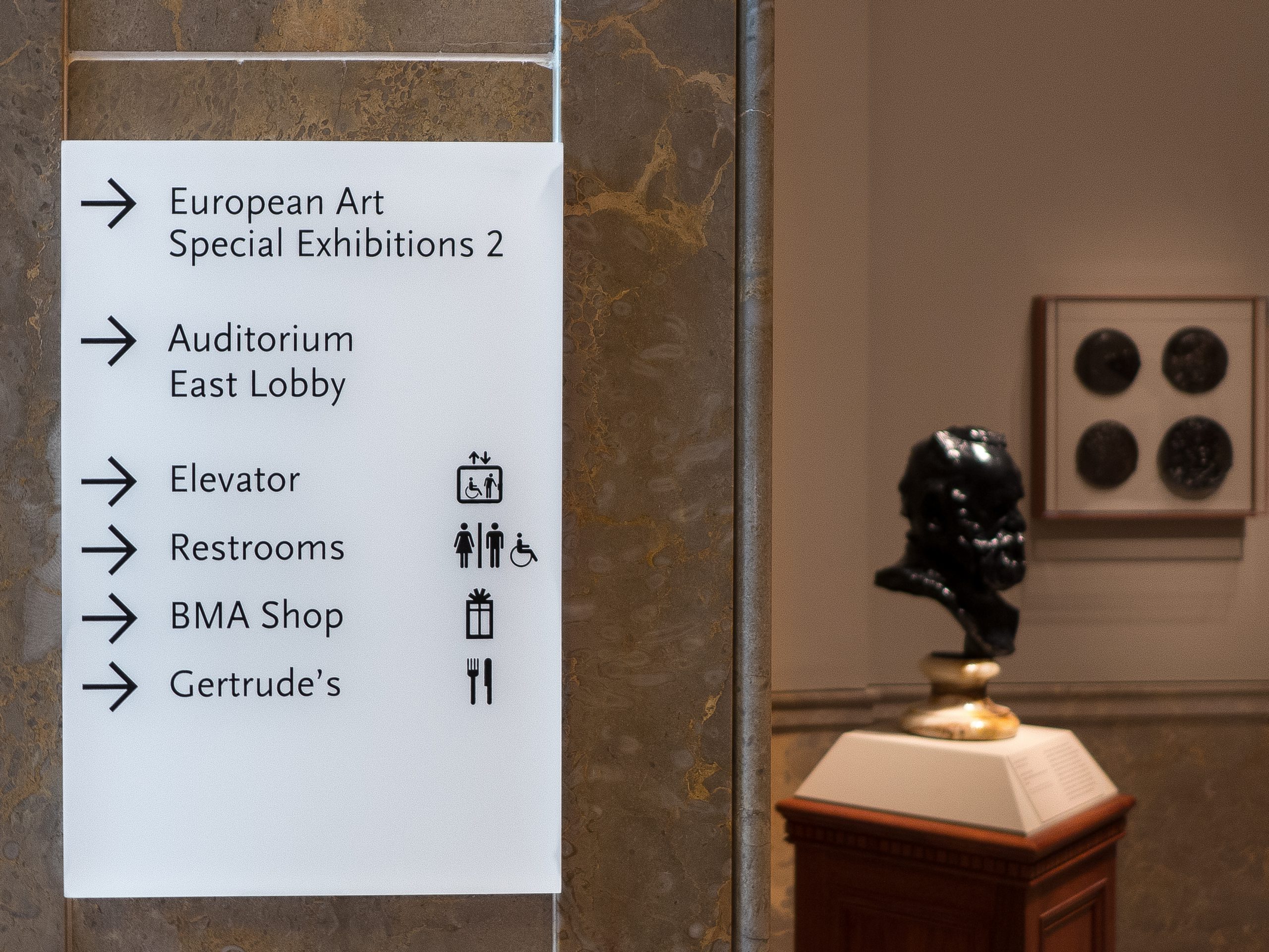
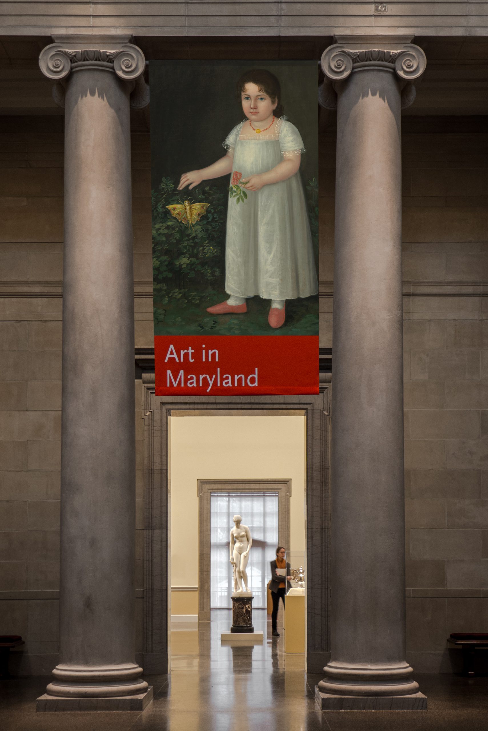
As part of a major renovation, the Baltimore Museum of Art hired C&G Partners to enhance visitor experience by improving wayfinding and the overall signage experience of the Museum. In addition to greatly improved wayfinding, the signs use photographs of iconic painting and sculpture to get visitors to "must see" galleries, like the famous Cone Collection, current shows and "hard-to-find" masterpieces. The interior sign program is conceived with a visitor centric perspective that allows easy navigation through a warren of corridors and different levels. The signs have been designed to integrate with contemporary and landmark historic interiors. The ceremonial steps and main entrance, long closed, were reopened with symmetrical museum identification and current show announcement signs that impart contemporary elegance to John Russell Pope's landmark architecture. The flanking contemporary building entrance created from accessibility, the museum shop and cafe, was also enhanced with a new illuminated identification, donor recognition and directional signage.
![C&G Partners [logo]](https://www.cgpartnersllc.com/wp-content/uploads/2022/07/CGP_Logo-black.png)