“Welcome to a semester of wearing nothing but black.” A deliberately raw, defiantly lo-fi brand identity for a fabled arts education program.
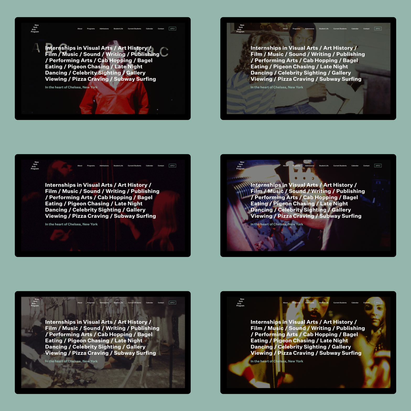

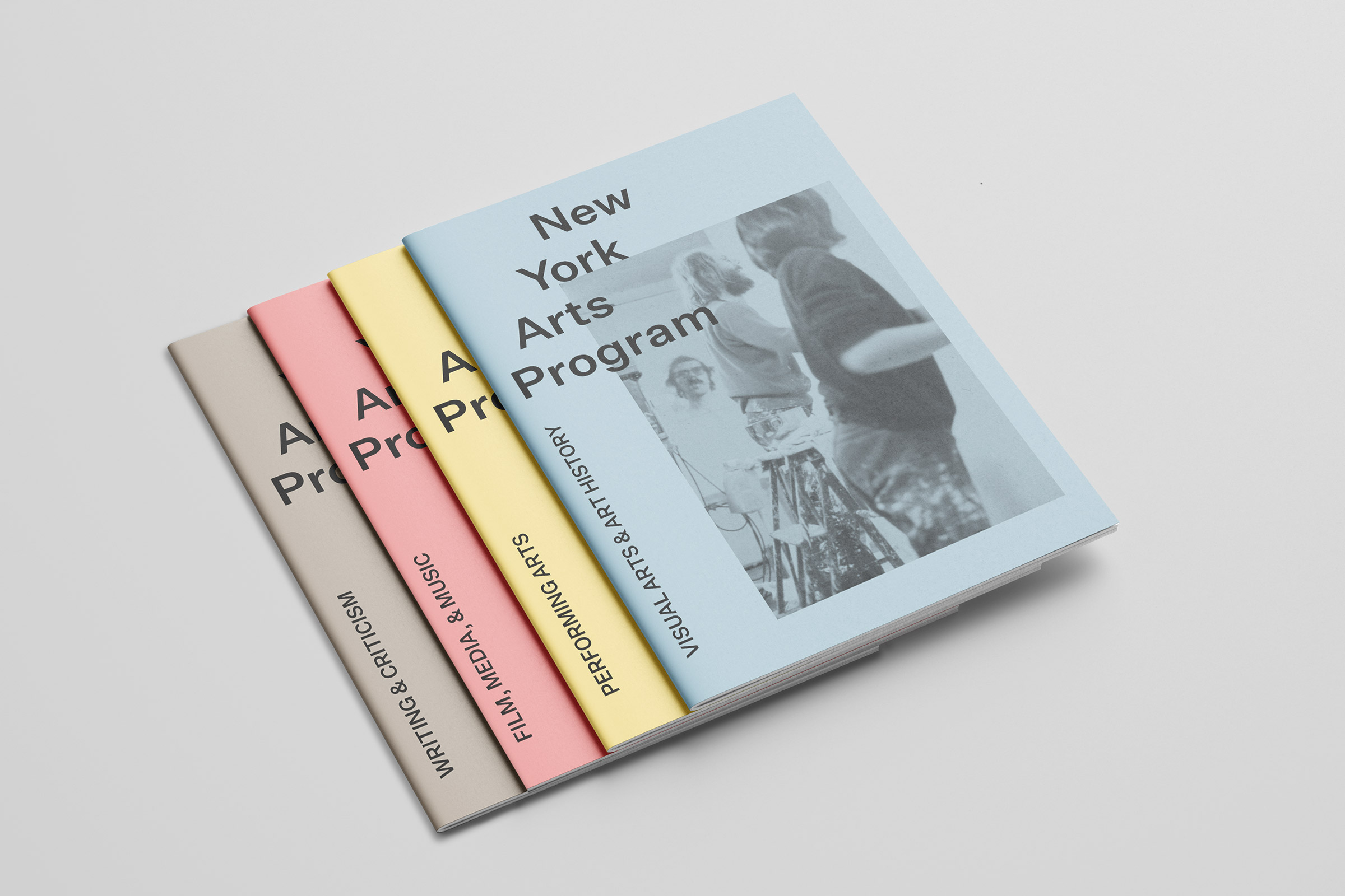
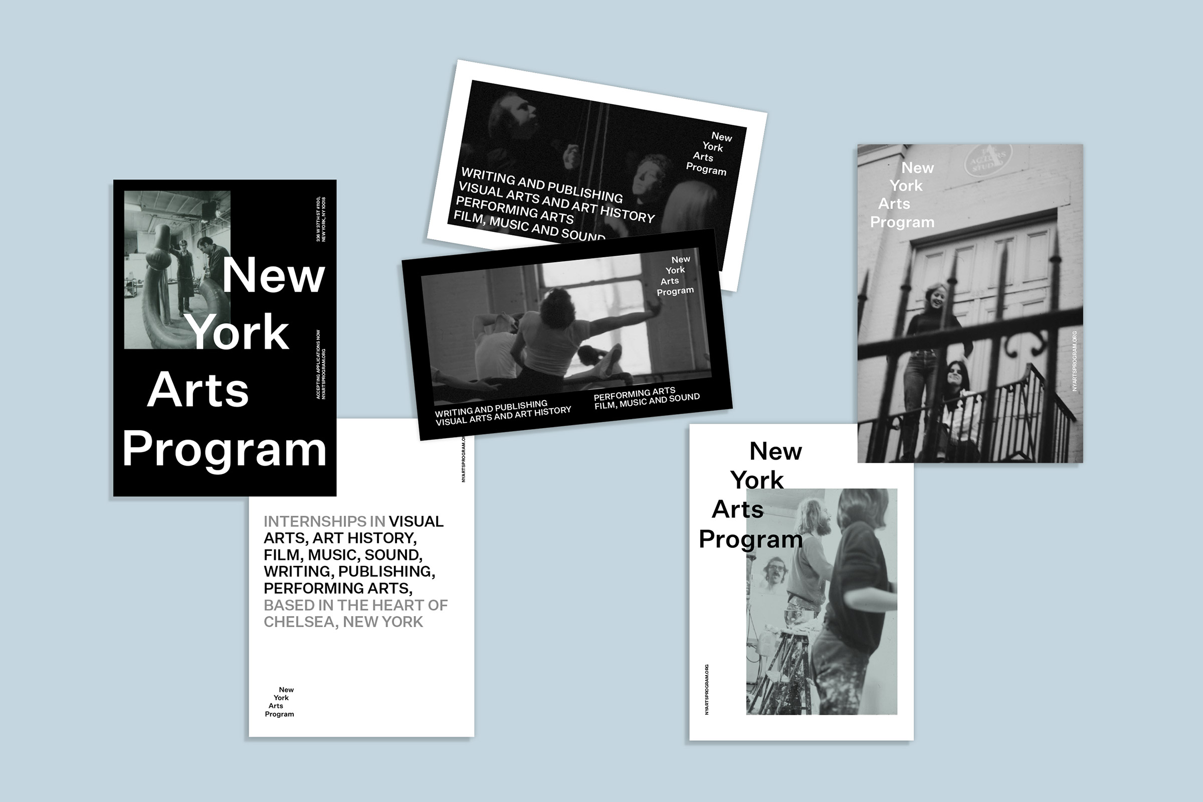
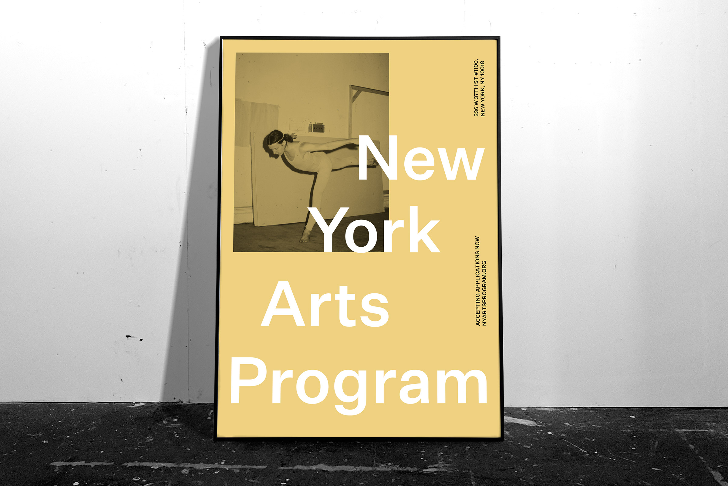
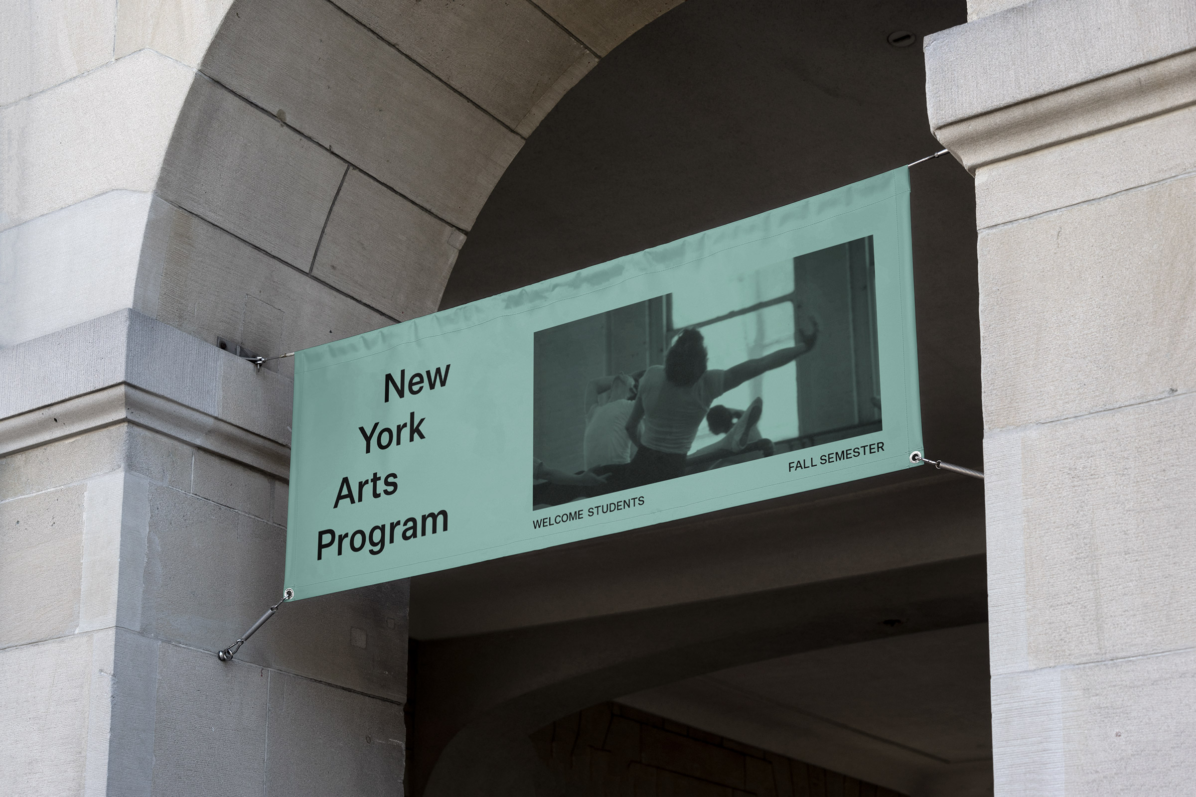
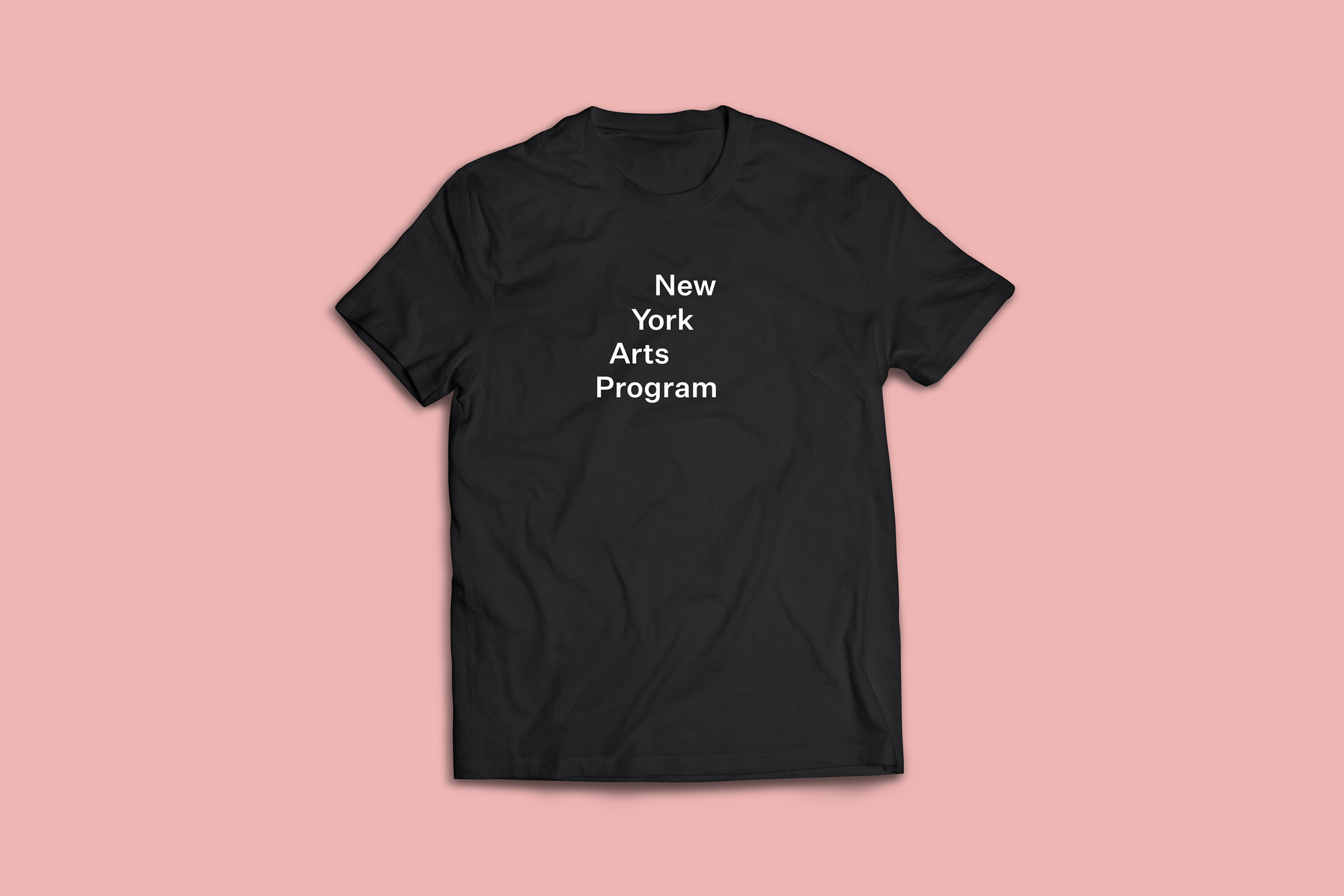
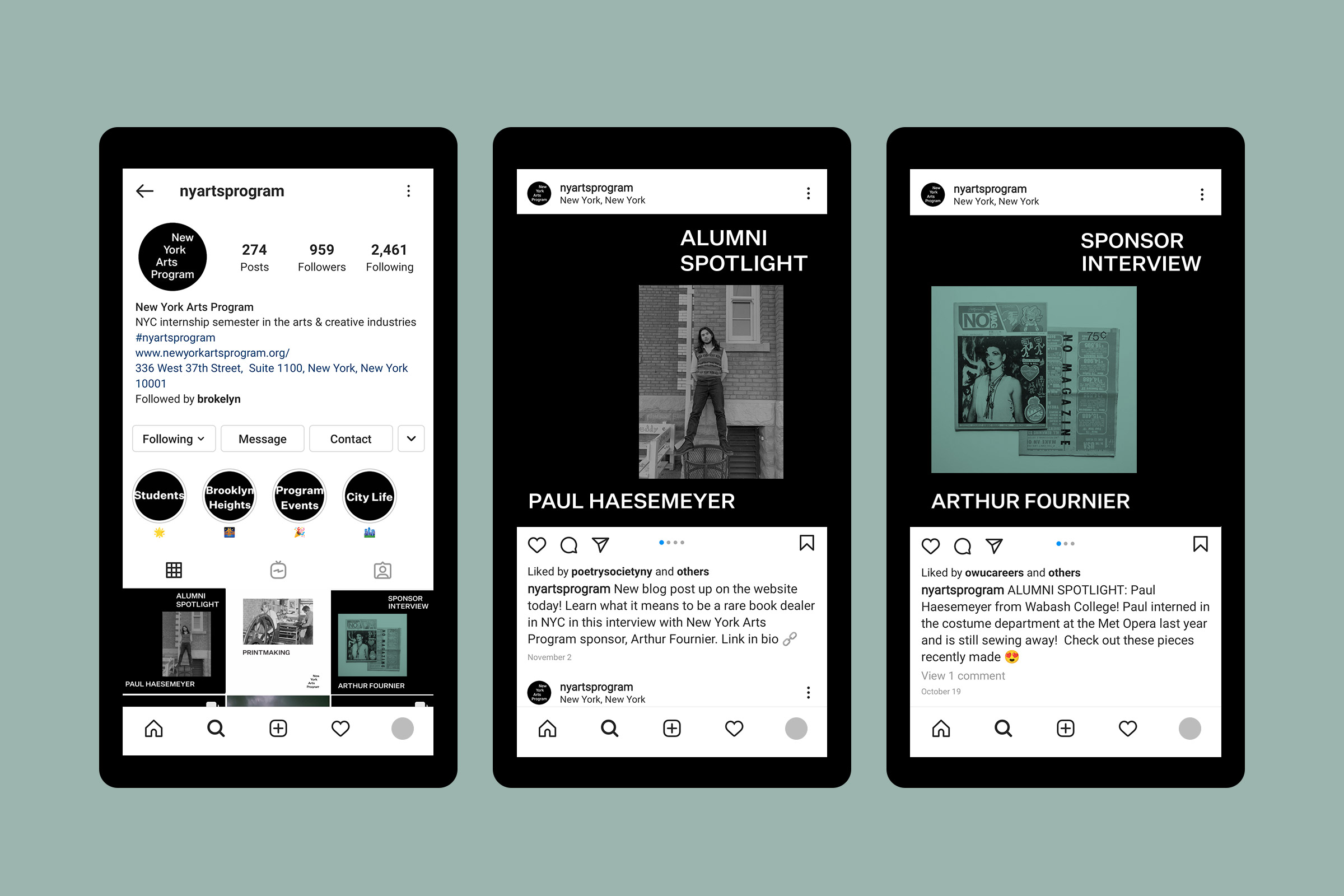
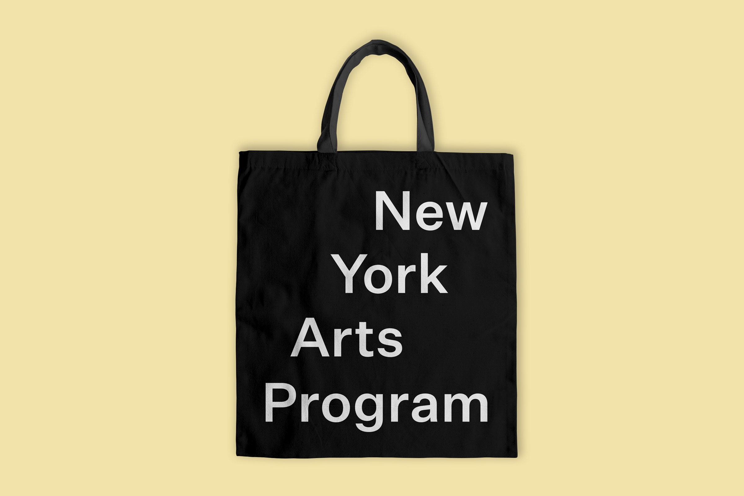
The brand identity and web design for the New York Arts Program are deliberately designed to evoke the low-fi promotional aesthetic of emerging artists and art spaces. The logotype is engineered to appear unconventional and raw, and has a second reading as a short set of steps leading upwards. The design work makes use of the Program’s archive of images from 1969 to the present, evoking local art history, narrative, and New York City grit. Containing saturated tones from real film and candid angles and moments, these images capture students and notable faculty in moments of learning. The pastel colors of the identity are a deliberate nod to black-only printing on colored paper, the one-time classic promotional technique of the emerging art space. In addition to basic black and white as primary colors, the identity program includes four secondary colors associated with the Program’s areas of study: Film, Media, & Music; Performing Arts; Writing & Criticism; and Visual Arts & Art History. A tone of green appears as an accent. Large, no-nonsense typography is paired with imagery in a non-cluttered way.
The brand voice, also by C&G Partners, is similarly inspired by the city streets — a combination of good humor and New York attitude. Questions like “What makes the art scene in New York so special? And why shouldn’t you be in sunny Barcelona instead?” are welcoming, loud, and knowing — like unsolicited advice you might receive while walking around Manhattan. The lo-fi brand is designed with social media in mind, targeting the Gen Z digital natives that will come to the program. The brand identity design is meant to act as an extension of the New York Art Program’s unique vision, putting student creativity to work with a fully immersive experience with New York City as their campus.
![C&G Partners [logo]](https://www.cgpartnersllc.com/wp-content/uploads/2022/07/CGP_Logo-black.png)