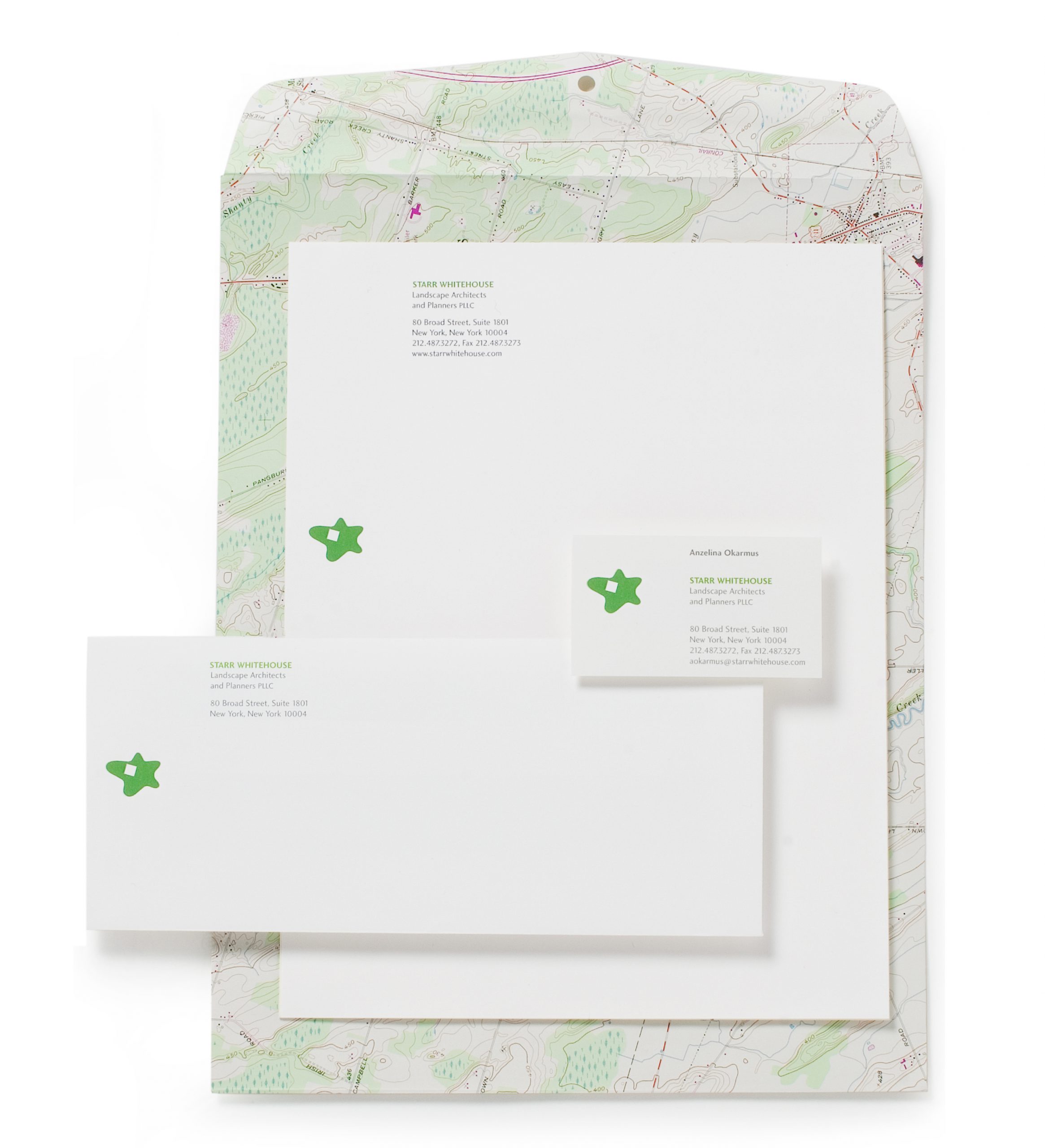
A logo suggesting a site plan, hiding a visual pun on the names of a landscape architecture firm's founders.


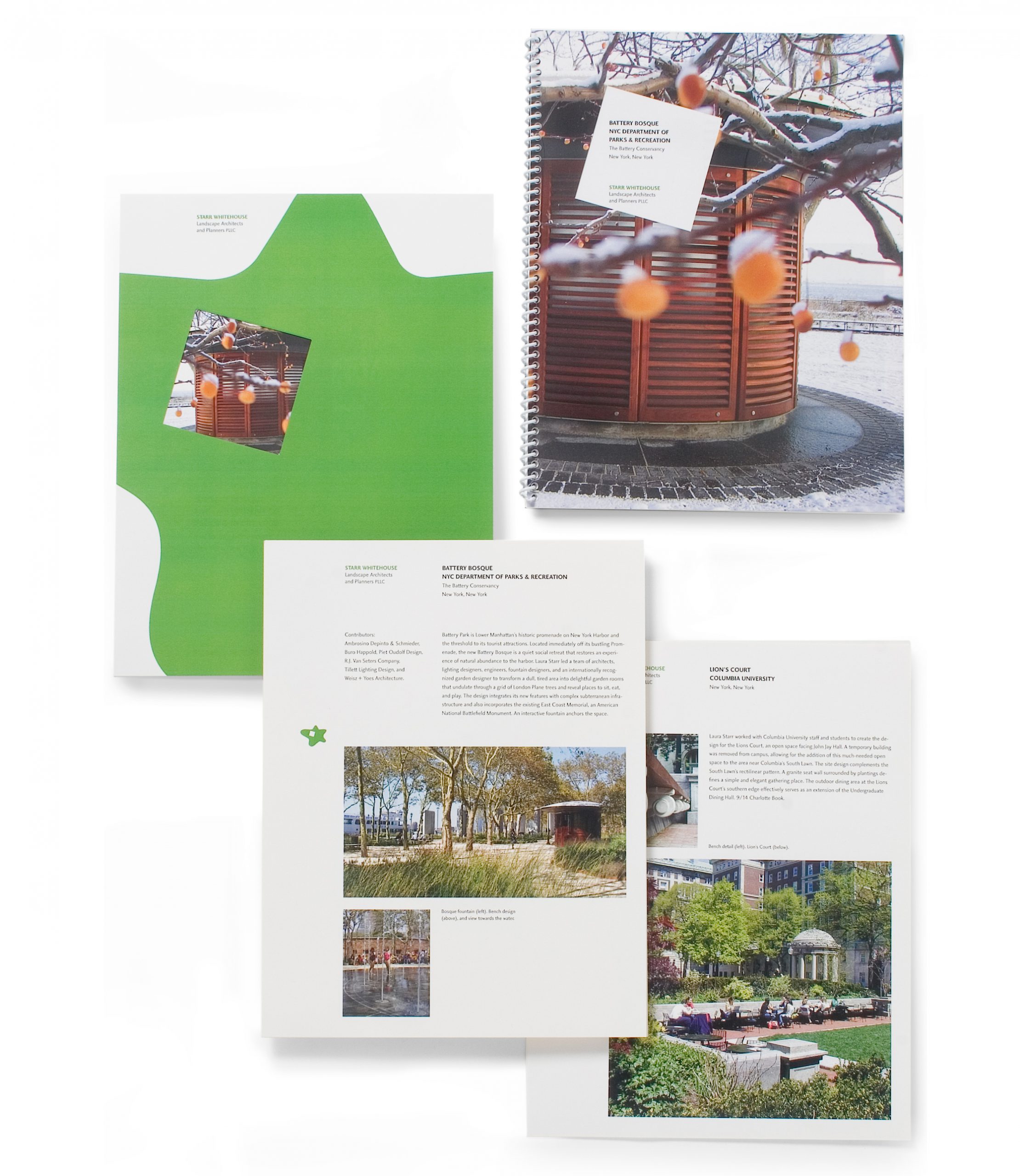
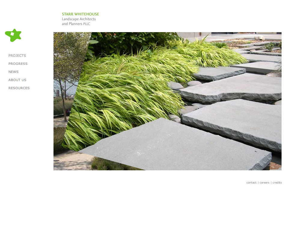
The organic green star and the tilted square not only visualize the Starr Whitehouse name, but also symbolize the landscape architecture services that the firm offers. The emotional and rational elements coexist in the identity the same way they coexist in the firm’s approaches and solutions. The marketing material we designed portrays the same qualities, relying on consistent but flexible communication elements. The website extends this identity by echoing the tilted square as the shape through which photography is revealed. Portfolio templates are designed to accommodate a variety of projects. The site provides a simple and intuitive navigation path for users.
![C&G Partners [logo]](https://www.cgpartnersllc.com/wp-content/uploads/2022/07/CGP_Logo-black.png)