An identity for an international archaeology organization for Near East and Mediterranean cultures.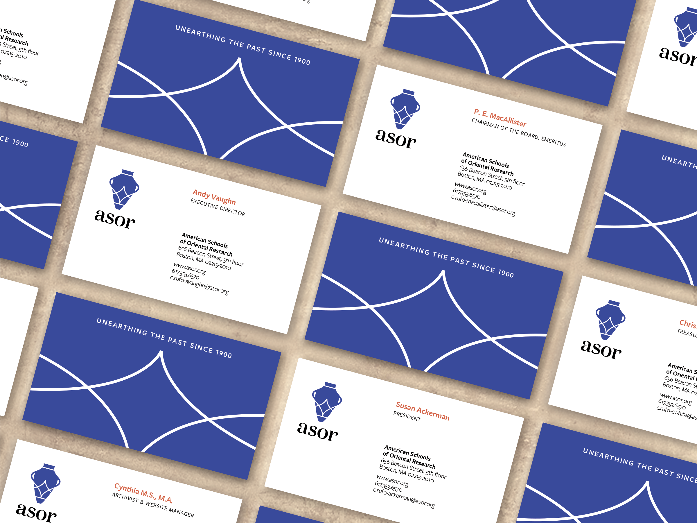
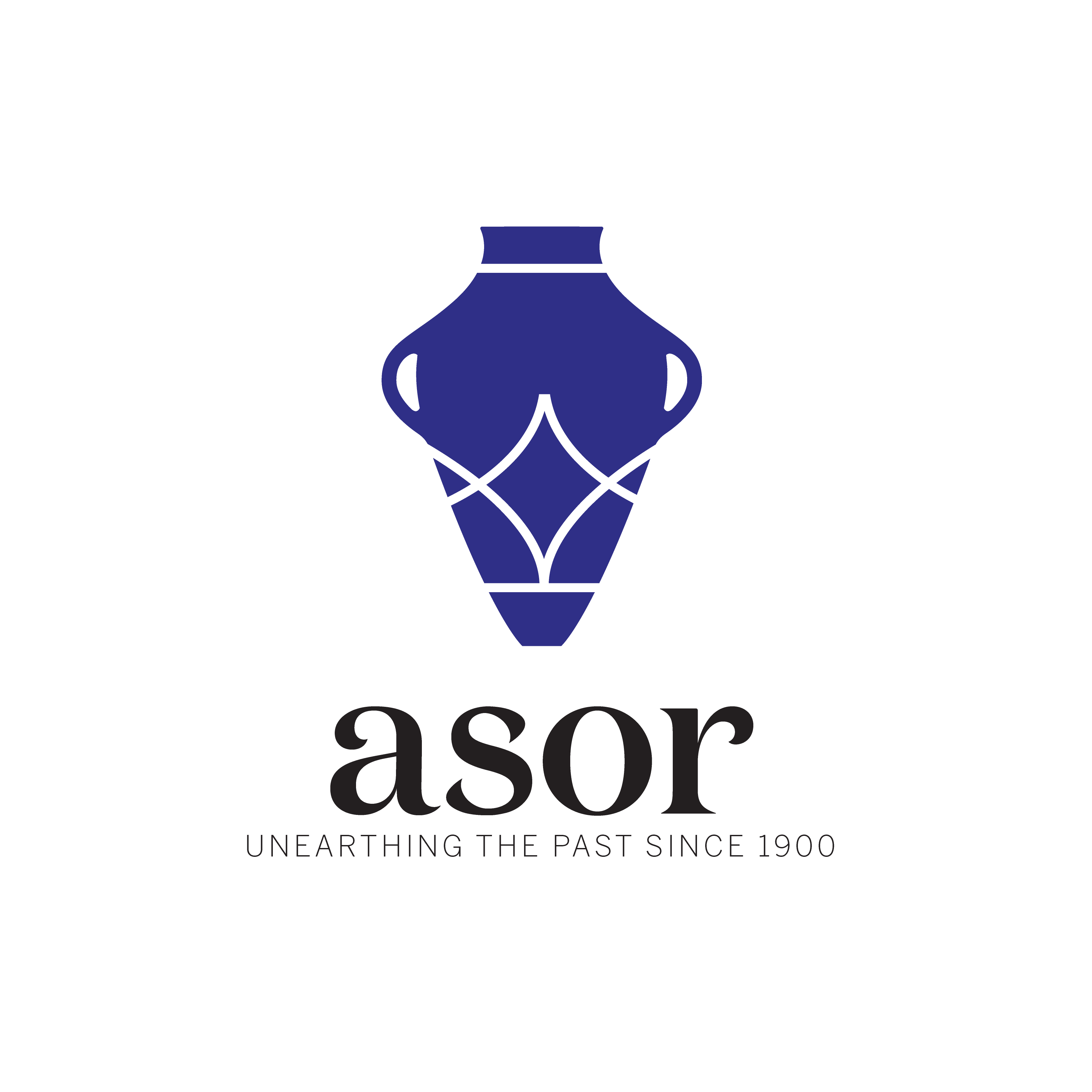
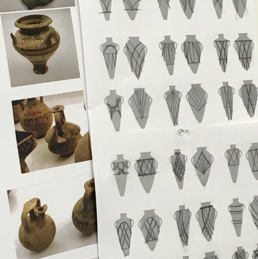
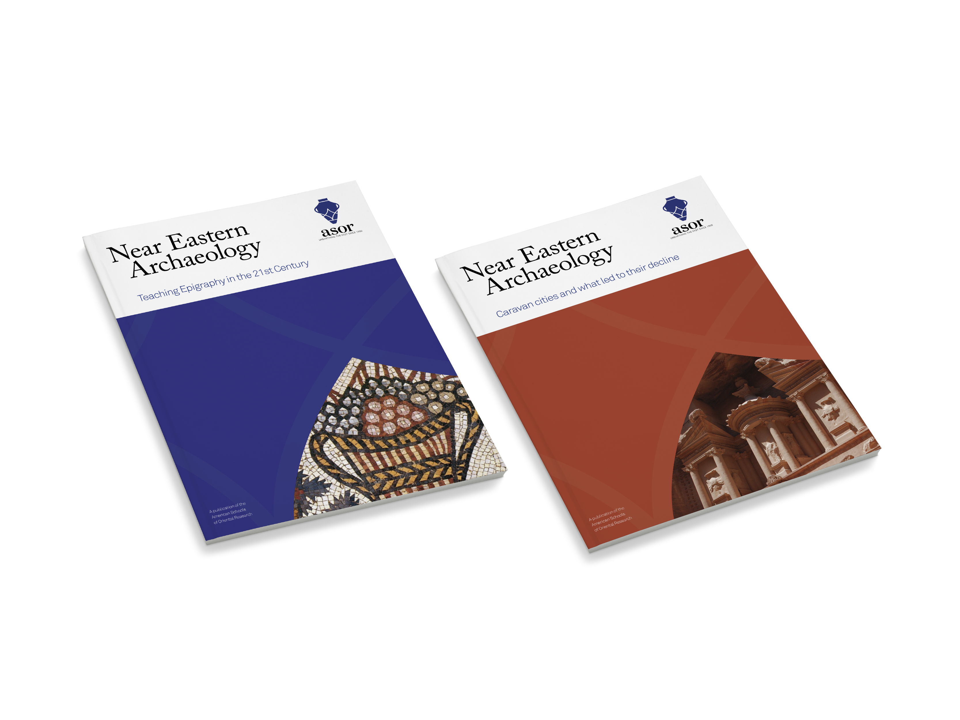
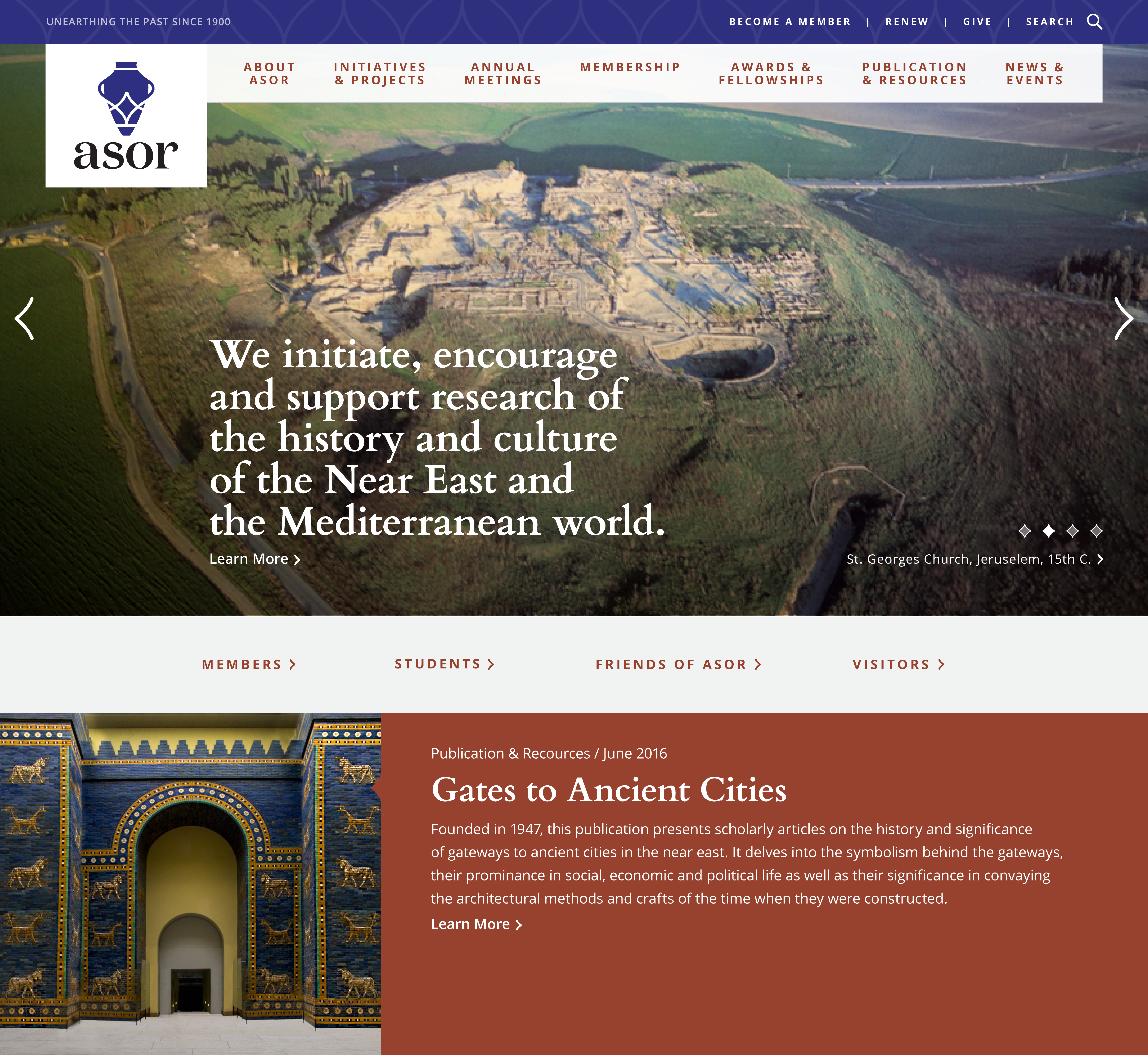
Founded in 1900, ASOR is an international organization whose mission is to initiate, encourage, and support research in the public understanding of the history and cultures of the Near East and wider Mediterranean. ASOR’s updated identity reflects the organization’s more expansive geographic outreach as well as its more inclusive, contemporary approach to archaeological research and fieldwork. The logomark is based on a classic Canaanite storage jar, an artifact that directly correlates with antiquities and is common in ASOR’s region of research. Developed from extensive research of archaeological patterns in the wider Mediterranean region, an abstract graphic motif is superimposed onto the jar. When viewed from a negative perspective, the logomark appears to be a reconstruction of broken parts, a concept central to archaeology. In tandem with the logomark is the logotype “ASOR,” a curved customization of the typeface Domain Display. Brand colors royal blue and terracotta, are combined with carefully considered brand architecture, and typography to provide a more holistic visual identity system.
![C&G Partners [logo]](https://www.cgpartnersllc.com/wp-content/uploads/2022/07/CGP_Logo-black.png)